
Exclusivo: Hablamos con Malika Favre y Anne Brassier, de la inglesa Airside
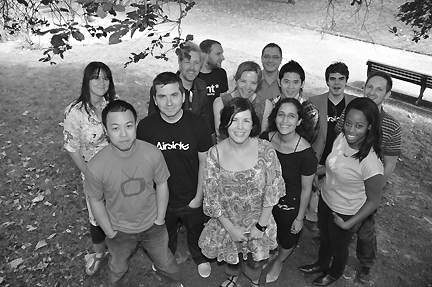
(Anne Brassier es la primera empezando de la izquierda, mientras que Malika Favre es la quinta, enfundada en su remera negra)
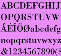
Mientras que muchos blogs replican una y otra vez el alfabeto creado por Airside para la revista inglesa Wallpaper de este mes, nosotros le hacemos un reportaje a su creadora, la francesa Malika Favre, en exclusiva. Con ella, y con la inglesa Anne Brassier, hablamos de todo lo que significa trabajar un tema que para varios latinos todavía es un tabú. Todo lo que tenga que ver con lo sexual, con el desnudo femenino, todavía es rechazado por ciertas comunidades del continente, mientras que en Europa es parte de la cultura popular, como sostiene Favre. "In England, or even France where I come from, sex isn’t really taboo anymore; or at least I would like to believe so..." "Movies can be very explicit over here and openly explore our relationship to sex in the current society, we see a lot of pornography in popular culture. I would say that London is a place where designers can express themselves very openly and without any taboos. When I came up with this font, no one perceived it as crossing a line, it was just a sexy, almost abstract, experiment that somehow fell into what Airside is about. However, there is a thin line between creating something overtly pornographic and something erotic & sensual, where what you guess is more important than what you actually see. I feel strongly that our font belongs to the latter", agrega la diseñadora francesa.
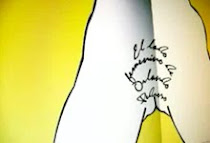
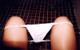
(Parte de la tipografía de Favre, basada en su anterior Alphabunnies )
How was the creative process to make this font? (Who is the font?)
It all started with the Hybrids print – a pair of cat-lady lesbians influenced by Egyptian mythology that I designed for the Airside Shop.
When I showed them to my fellow Airsiders everyone seemed excited about it (especially the boys of course…). The consensus was that there was something worth exploring here. So I did.
Next I was drawing some naughty bunny-ladies when Guy (one of the designers ) noticed that some of them really looked like letters. So I started working them into letter-shaped sexual positions and a couple of weeks later the Alphabunny alphabet was complete. Wallpaper saw the print and decided to commission us to do something for their Sex and Art issue along these lines. I wanted to push the first alphabet further and explore new ways to create the letters so I worked from the “G” (that I loved) and designed a whole new set for them.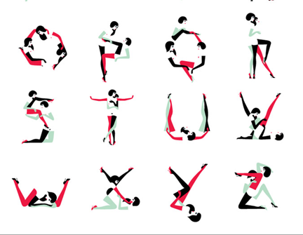
(Lo que faltaba de la tipografía de Favre)
Why do you think the sexual has not been taken into account by typographers to create fonts?
Shaping sexual position into letters has been done a lot actually. But if I’m honest. sex and letters are rarely a tasteful combination. It often ends up being something that feels too forced, and often clichéd and vulgar. The wallpaper Pin-Ups font and the Alphabunnies are more of an illustration experiment than a functional font. The negative space of the body is what makes it interesting and new.
(Poderosos bocetos de la tipografía para Wallpaper)
Should there be more sexy fonts out there? If it is done in an interesting way, sure, but there needs to be a reason for it. Why there have been only fonts with sexual situations between women?
That’s a good one… hum… how can I reply to that without sounding like a feminist… I like drawing hips and curves more than 6-packs! But I definitely intend to explore a male alphabet at some point. Don’t get me wrong, men are gorgeous, but women are softer and more pleasing for the eye and mind in that particular context. On the practical side, the use of tights and gloves as what shapes the letters would not work with boys : )
How have your clients reacted to such an interesting building?
Our clients tend to be very open-minded. They come to Airside because they want us to bring our quirkiness and humour into their brief. Probably not all of them have seen the Wallpaper piece, but the ones who have appreciate the fact that we are not scared of expressing ourselves on self-initiated projects.
I guess as long as we don’t try to answer every brief with naked Amazonians, they will respect the fact that we like to push the boundaries of what we do.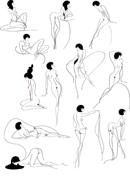
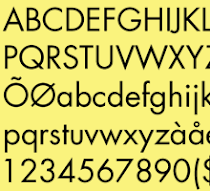
(Más bocetos de la tipografía)
You had already worked on a similar theme?
A couple of years ago we had this Tea Party screenprint, designed by Richard Hogg, that Airside also gave away as a downloadable screensaver. That was a very sexy animated piece. Also we contributed to Grafuck in the early years of the magazine. Airside always had a soft spot for kinky illustrations.


No hay comentarios.:
Publicar un comentario