
Exclusivo: Jeff Knowles nos cuenta todo sobre la tipografía New Deal
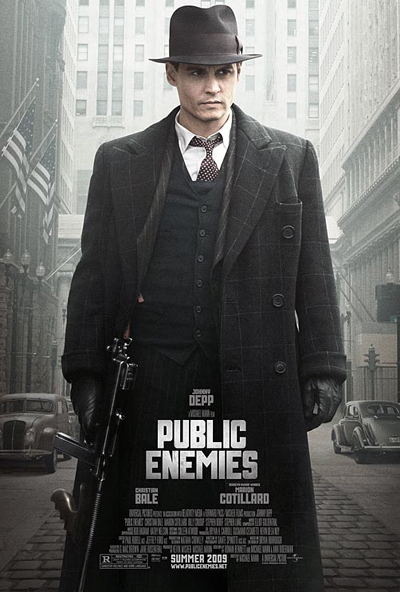
 Como te adelantamos ayer, los tipógrafos Jeff Knowles y Neville Brody habían creado la tipografía New Deal para la última película de Michael Mann, Public Enemies, protagonizada por Johnny Depp. Y El Norbi charló con Knowles sobre el proyecto. En sus respuestas uno puede encontrar también como un director de cine participa de la creación de las tipografías que aparecerán en los títulos. Una especie de corte del director se puede encontrar en la New Deal.
Para conocer las distintas versiones que Knowles y Brody le presentaron a Mann pueden entrar al blog Chill-Art.
1) You have been researching typography to achieve New Deal. Historical research is important in creating a typeface?
I think it depends on what you are trying to achieve from the typeface. If you are trying create something completely new or abstract, then I don't think the historic aspect is important, you could do research for inspiration, but it might not come from historical typography. With the regards to the New Deal Typeface it was very important to research the typography of the era. The director, Michael Mann, was very specific about the era (1930) and the movement (New Deal) that we should research so that the font would sit perfectly within the context of the film. The wolfsonian gave us a wealth of material to reference.


2) What value can have signs of the time to define the style of a letter?
You have to look for the twists, the graphic devices that give the typeface its style and character, then apply this in a modern way.
In the case of the New Deal font, the director wanted something very specific, so we just interpreted his thoughts and needs, he even sent us some of the WPA poster he like, so we took that as our lead.
3) In a way, the New Deal is the translation of a typesetting era. Which type would define the current era?
One of the most popular fonts currently is Gotham, its very much like Helvetica in the sense that it is hard working, classic and timeless, but Gotham was also created from historical references, signage from buildings in New York, that actually date back to the WPA era until the 1960's, so Gotham, although used heavily today, has much historical significance.
I terms of typefaces that are very much being used now and are from now, I would say the more rounded typeface, there seems to be a trend of using rounded fonts, they have a human accessibly friendly quality, which is probably one of the reasons rounded fonts are popular for rebrands. I would suggest Omnes and Bryant, but even these fonts have historical backgrounds. A very good example for a current graphic font would be Kada, the style of this font is very popular at the moment. Also the typographic work used by Non-Format
4) Create a font for a film is the same as creating a font?
You might need to take into consideration how certain images work on screen, there is the classic case of someone wearing a striped shirt of TV, it reacts with the fact that a TV images is also made up of many lines, and thus you get strange distortion happening. This would be something to keep in mind, like with the new deal font, they decided to use the light version and space it quite widely, this give the characters room to breath, avoid any distortions and make to legible. The one thing to remember with moving images is it dictates how long you have to read the text, in any over medium you dictate how long you spend reading the text, so legibility is an important factor. We tried using the heavier weight of the font and setting the it quite tightly, like it has been used on the poster, but when this was applied to the film and given motion and time restrictions, it was far to heavy and overwhelming, hence the use of the lighter version that is widely spaced.

5) How long it takes to create the New Deal type?
Was done in a day, was put into fontlab in half a day, the director liked the font instantly, he just wanted to see another cut, and a thinner version, so the other two weights probably took a day each/half a day each to get them in fontlab, thats probably total labour time, obviously the project was happening over a longer period of time though. The most work was getting the main title "Public Enemies" done, we try a lot of different options, and did a lot of revisions until the director liked it.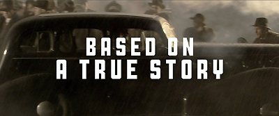


+15.06.00.png)