
Lo Mejor del 2010: Los afiches tipográficos de Jerod Gibson

Nos está gustando esto del minimalismo dentro del diseño. Por eso, te lo estuvimos presentando a través de los más recientes referentes de ésta especie de nueva vanguardia. En Visualmente conociste por qué al austriaco Albert Exergian le pareció conceptual un mantel para hablar de The Sopranos. También al brasileño Pedro Vidotto, y su versión conceptual del afiche de Inglorious Bastards.
Después te presentamos al francés Ty Lettau, quien nos habló de sus versiones sintéticas de discos tan emblemáticos como Sgt. Pepper's Lonely Hearts Club Band o Dark Side Of The Moon.
El 25 de septiembre pasado, te presentamos al norteamericano Jerod Gibson y a sus poderosos afiches tipográficos, donde se conjugaban películas y las frases más reconocidas de ellas hasta armar un verdadero afiche minimalista con muchas letras. Fue un reportaje exclusivo que le hicimos para Tipográficamente.
1. How he came to make these typographic posters of movies?
I wanted to create an ongoing series that was different than my usual work, but at the same time do something that I know interested me and allowed me to have fun. My friends and I always tend to bring in movie quotes into conversations. I had the idea one day to actually bring these into print. I wanted to still do something nice and simple. So by using a prominent silhouette from the movie and a single typeface I was able to do this.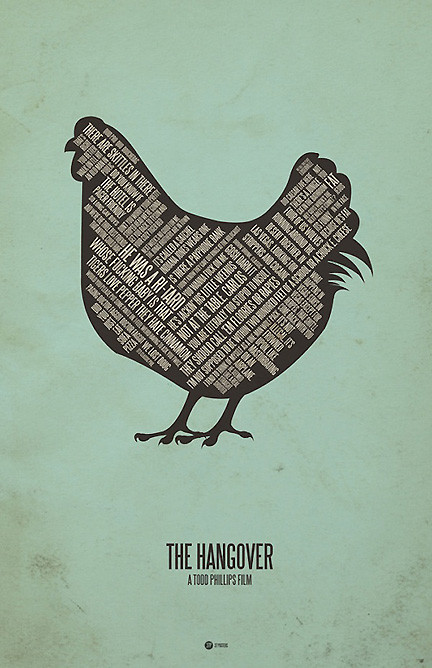
2. Why did you choose these films?
All the films I picked are personal favorites. I want to keep the series fun and more of a hobby rather than work.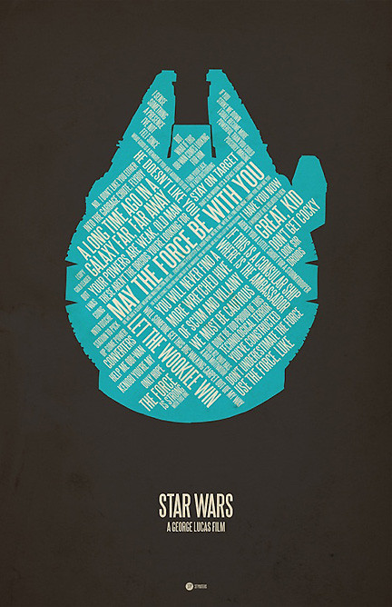
3. How did you select those phrases or dialogues?
Most of them are either my favorites or favorites of friends. Sometimes I need to research exact phrases too.
4. You get us very interesting synthesis levels. The first with the background image and the second sentences. What was the hardest to achieve?
The backround image is always the toughest. I need something that can fill enough text, without being over complex. I'm working on a 'Kill Bill Vol1' right now, and that one is being a bit difficult :)
5. What is the poster that you like and why?
My personal favorite is the 'Clerks'. I think because it is so simple, and it also sprung the name '37 Posters.'
6. How it works technically? While they are made in Illustrator and finished in Photoshop, you worked before in sketches on paper?
I do some light sketches before hand, but most of the work starts in AI and ends in PSD.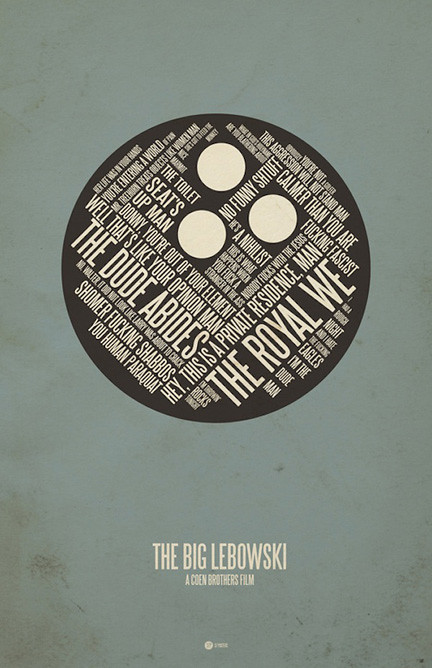
7. How soon do one of these posters?
I usually start 2 or 3 at a time, and jump back and forth between them. I'll try to get a couple done a week.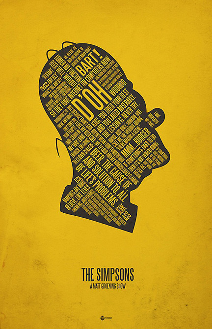
8. Have a poster that after completion is not like the results?
A couple times about 3/4 through the process I haven't, just because the typography and image weren't melding well. So I'll usually find another image.


+15.06.00.png)