Lo Mejor del 2010: Usando un iPhone para dibujar, por Jorge Colombo


(Portada del 16 de noviembre, de The New Yorker)
Nuevamente, Visualmente te batió la posta. Los blogs suelen ejercer cierta impunidad que no es fácil detectar y, a veces, como hijos del nuevo periodismo, mienten en porciones grandes o pequeñas, en lugar de investigar.
Por eso, el 26 de marzo quisimos conocer al artista detrás de la portada, en lugar de repetir lo que se decía de él, que era mentira. En exclusiva para Visualmente, el ilustrador portugués Jorge Colombo nos contó cómo dibujó en su iPhone la portada de la revista norteamericana The New Yorker (la tercera que hacía de ésta forma). Es que su técnica era tan novedosa que los blogs no la entendían y en lugar de entrevistar al artista para preguntarle en qué consistía, cosa que hicimos nosotros, se animaban a mentir. Así llegaron a escribir que Colombo dibujaba sobre una fotografía, cosa que le molestó mucho al portugués."That is a lie. I never take photographs. They invented that. That's so stupid". 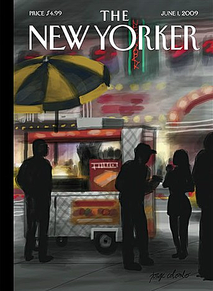
(Primera portada con esta técnica, del 1 de junio)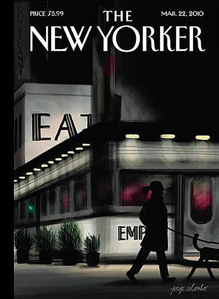
(Portada del 22 de marzo)
1) How can you even begin to draw on an iphone?
I never liked to have a lot of equipment or to need a big studio. The simpler and smaller, the better. Being able to do most of my work with a toolbox that fits in my pocket is perfect for me.
2) How is the process to achieve an illustration for The New Yorker?
Françoise Mouly, who used to edit Raw magazine on the 1980s, is the person who chooses all the New Yorker covers. She has worked with hundreds of illustrators and keeps alive the magazine's graphic tradition. When she discovered my New York landscapes done on the iPhone, she had me come to the office, where we talked about Arthur Getz. Together with Saul Steinberg and Rea Irvin, he was one of their most prolific cover artists, and pretty much defined what a contemplative New Yorker cover was. 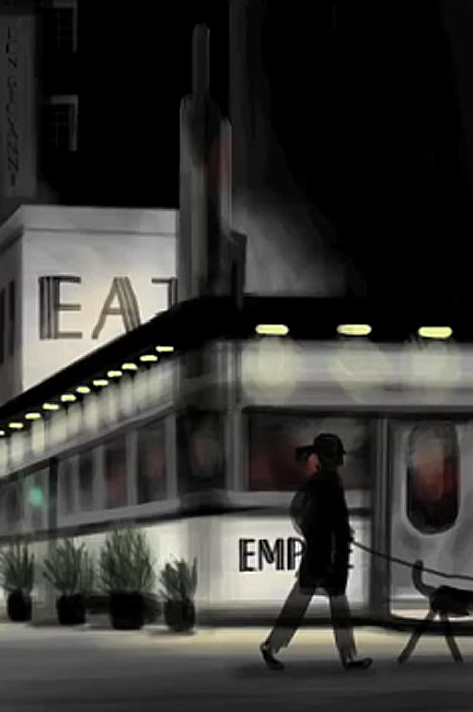
3) We want to talk about the concepts. You gets the idea to these covers or works with the editorial?
It's different for each artist. Some send finished art, others discuss concepts extensively. In my case, I walk around the city, find places to draw, and send them digital files of my drawings. They choose which ones to run on the cover. No previous discussion at all.
4) You have received many requests for this editorial to make their covers with the IPhone. Why do you think this is like this?
These days it's hard to tell what's done with computers and what isn't. It's the same thing in music. My drawings take advantage of the convenience that working digitally gives me, but they are very similar to pieces made with traditional media: gouache, watercolor, pastels... And people like to see things connected to tradition.
5) The above illustrations were closer to the vector. Why the change?
My older illustrations were done with pen, or brush, or pencil, and painted with watercolor or Photoshop. I never worked with vectors. But why do the same thing all my life? Change is good!
6) What artists have influenced you?
Many of them are photographers -- Raymond Depardon, Walker Evans, William Eggleston -- or filmmakers -- Orson Welles, Wim Wenders, Woody Allen. I also like cinematographers like Gordon Willis or Roger Deakins. Plus, of course, painters like Hockney or Hopper.