
Lo Mejor del 2010: So You Need A Typeface?, por Julian Hansen
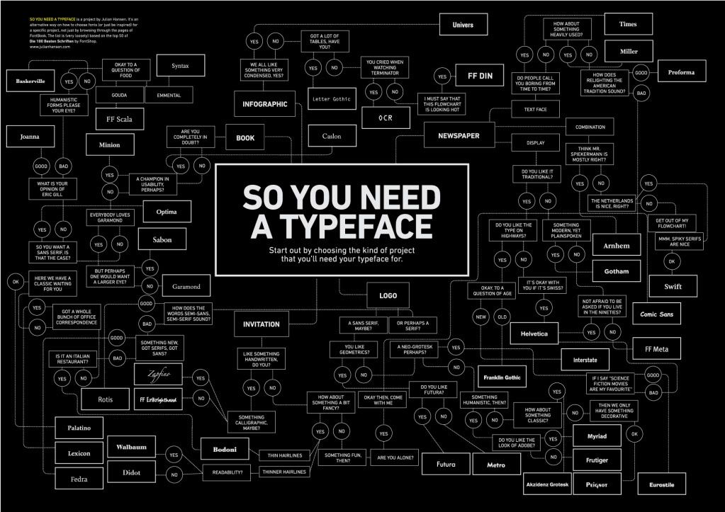
(Hacer click para agrandar)
Twitter explotó en septiembre con la aparición de una infografía mural que buscaba aportar soluciones al problema diario de la elección tipográfica. Pero que nadie crea que éste proyecto le pertenecía a un tipógrafo o a un profesor de tipografía de algún nivel de educación existente. Tampoco fue un diseñador consagrado el responsable del gráfico So You Need A Typeface?.
Esta idea pertenecía al estudiante danés Julian Hansen, de la Danish School of Media and Journalism de Copenhagen.
A través de una infografía se podría establecer una serie de pautas a seguir a la hora de elegir una tipografía. Esta poderosa guía para elegir las tipografías correctas para cada situación mundana se disparó en Hansen después de asistir a un curso de diseño gráfico en Krabbesholm Hojskole en 2007. Allí, su profesor blandía a los cielos sus opiniones tipográficas como máximas filosóficas, a lo que el estudiante no podía responder con la misma pasión, ya que su conocimiento era muy limitado. 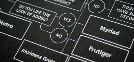
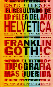
Luego de ver la película Helvetica en clase, Hansen no lo pensó más y tomó la decisión de estudiar las diferencias y similitudes entre la Helvetica y Arial. Así comenzaría su largo camino que lo llevaría a abrazar a las familias tipográficas casi como un apóstol sigue a su mesías.
Hoy, su poster-guía So You Need A Typeface aparece reseñado en cuanto blog de tipografías y afines se precie de serio, pero nadie habló con él. Y, adivinen que blog latino será el primero en hablar con Hansen sobre todo esto?
Por eso, el miércoles 29 de septiembre, Visualmente te presentó al genio creador de Typeface, con ciertas confesiones imperdibles. 10 preguntas que no tendrán desperdicio. Él también va a opinar sobre la Comic Sans.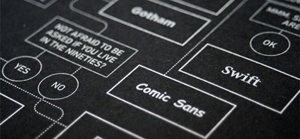
1. Why all roads do not reach the Helvetica?
I don't think that Helvetica is suitable for all kind of projects - I would never ever read a newspaper in Helvetica, because I don't believe it is a typeface that is very readable. Like Paul Rand whispered to one of his students: "Helvetica looks like dog shit in text ". Also I think that the world would be a boring place if everything was set in Helvetica. 
2. How he came to So you need a Typeface?
The reason why I did the poster was because I experimented on finding a new way of selecting typefaces instead of just browsing through the pages of the fonts on my computer. In the beginning I thought that I could find a way that was more based on facts, but in the end I realized that choosing fonts is something humorous, based on personal taste as well as the fonts having different strengths and weaknesses.
3. Since his work has much humor, which was more amused comments write?
Indeed it was very fun to write. Some comments came out of the blue, while some came after a long analysis. The Bodoni comment was one I've overheard at some time, I couldn't remember where. The Comic Sans was inspired by a poster I had seen, and I think that was the funniest because you had to interact with the poster to find it. 
4. You're still a student, no? Why do you think that no design professor came up to do a job like yours?
I'm still a student yes. I'm not sure why this hasn't been done before. I knew I would make an infographic, but I didn't know it would become a flow chart, so I wasn't something planned. I think that the reason why I hasn't been done before is probably that people often don't associate choosing typefaces with some humorous.
5. Why do you think people do not know how to choose fonts when doing a project?
It's a very good question. I think it's because a lot of people have not got enough knowledge about typography and therefore it can seem to be an overwhelming task to choose between thousands and thousands of typefaces without knowing what separates them. My advice to any graphic designer would be to design their own typeface, because when you do that you begin to understand what the differences are between the typefaces and why some typefaces works well for small text while others certainly does not etc.
6. You can enlarge what he wrote about the OCR and the Comic Sans?
With OCR the comment in the flowchart was quite frankly a comment that I wrote really fast. I had OCR in front me and I honestly thought: "Why would anybody ever use this typeface?". I didn't know what to write. I realized that it was a typeface that was based on a principle so that machines could recognize it, I then thought that it must be a typeface that people who loved machines would use - therefore Terminator. With Comic sans, I didn't intend to put it in the poster, because I think it's a ugly typeface but it's also a joke between graphic designers, so I decided to include it as a joke that you could only use it when you were alone and no one was watching you.
7. How long did you do So you need a typeface?
The poster took me five days to design. Most of the time was spent reading about the typefaces and their origins. 
8. Given that you have studied in particular the relationship between Helvetica and Arial, the second font into something more than the first?
But Arial is a copy of Helvetica, and it's uglier than Helvetica, so I can't really see any reason to use a bad rip off of Helvetica. 
9. After you So you need a typeface, you think you deserve any modification or addition?
But I would love to make the poster even larger with even more categories and even more fonts. I could be an exciting project, but as it is I think the poster works - because it's mostly meant to inspire people to think of how they choose specific typefaces for their projects.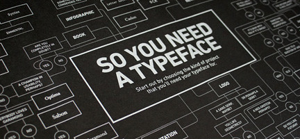
10. In addition to Erik Spiekermann, who discussed most about your job? Has received a complaint about a set designer?
I've actually seen the designer of Quadraat, which is in the poster didn't understand why the question "How about something that relights American tradition" lead to his typeface. It was a mistake, it was referring to another typeface, Scotch, that wasn't included. But that is corrected in the current version of the poster.


+15.06.00.png)