Exclusivo: Hablamos con Joshua Kemble
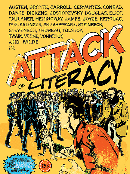
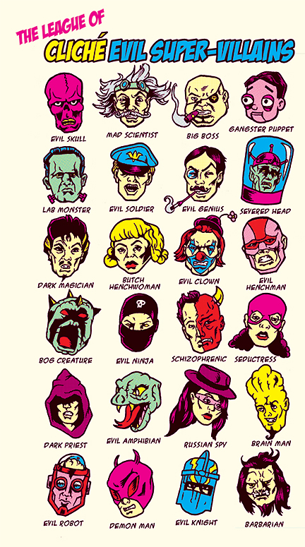
Te lo mostramos el jueves. A alguien se le había ocurrido convertir a los filtros del Photoshop en héroes como si fueran de la Marvel o de DC Comic. Ese que pocos nombraban era el artista norteamericano Joshua Kemble que venía trabajando en el diseño original para t-shirt gringas. Pero este misterioso personaje ha sabido encontrar el común denominador de los superhéroes y de los villanos al punto de crear su personalísima legión de clichés. Para hablar de esto y de otras cosas suyas, a continuación el reportaje a Kemble, otro lujo de VisualMente, exclusivo para vos.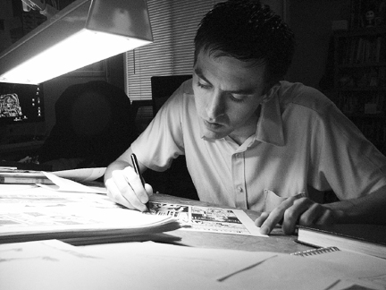
 1) How to make art for t-shirt?
I usually try to think of a concept that I would like to wear on a t-shirt. The most successful shirt designs I've done tend to be designs that I would actually wear. Chances are, if I'm into it, there're people out there who'll be into it as well. I then rough out my concept, then hand ink the artwork and color it in photoshop or illustrator depending on what my client wants to print it from. Usually I prefer photoshop. Then comes the fun of color separating the artwork.
2) You feel more comfortable doing t-shirt or comic books?
I think shirt design is much less taxing. It takes a lot less time to work on them, and a lot less thought. Conceptually though, t-shirts can be quite challenging. Still, I'm definitely more comfortable creating comics, as that's where my life's passion is. Unfortunately, comics take much more time and dedication to make. 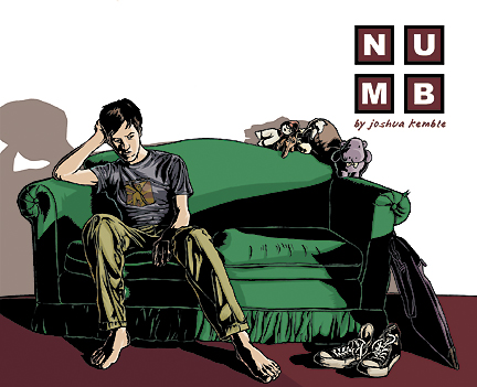
3) Your Numb speaks of a comic writer and his creative block by a broken heart. How did you avoid the common place for these stories?
I think honesty and passion really tend to save stories from the cliché. When I wrote NUMB, I drew inspiration from my own experiences, then added an ironic twist to it. I'm convinced though, as an artist, that as long as you are passionate about what you create, people will be able to read the passion you put into your work. It somehow seems to transcend mundane reading, when you can tell the writer loves what they're writing about. I also think spending time trying to create dynamic paneling and imagery helps the story a lot as well.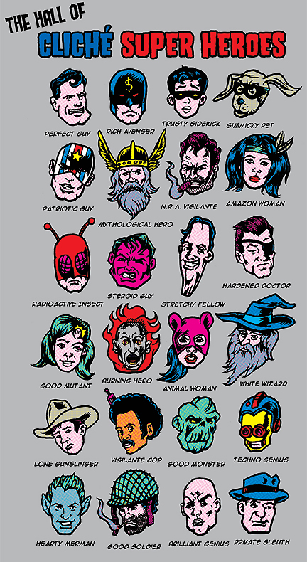
4) How to define your style?
It's definitely comic book influenced. I've always been drawn to inked line work with lots of feathering and heavy blacks. I'm also really fond of flat color. So my aesthetic is heavy black ink work in a comic book style with flat color. It's a little Retro.
5) What are your artistic influences?
Mainly, Charles Burnes, Daniel Clowes, Adrienne Tomine, Chris Ware, Jack Kirby, Windsor McCay, and George Herriman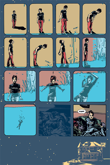
6) How did you convert Photoshop filters in superheroes?
I worked with the awesome design folks at the Chop Shop. They gave me the general concept, then I researched loads of old Jack Kirby artwork. I then drew the super heroes with as much cheeze as I could think of, then halftoned the colors to hopefully emulate old comic book artwork. I have to definitely tip my hat to the folks at the Chop Shop though. What mostly sells t-shirts is the concept. It's sometimes harder to come up with a selling concept, than a well rendered illustration, so for me, I think the Chop Shop's concept for this sells the shirt much more than my artwork. 