Minimalismo: Hoy. Tom Wahlin
1. How the idea for Music For The Masses?
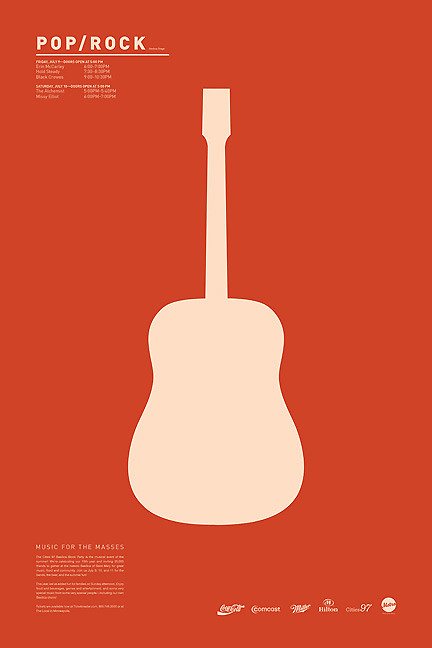
Music For The Masses was a project my senior year of school in advanced typography class. All of the content was provided. The purpose: To create variety while keeping a consistent theme: "Basilica Block Party."
2. How was the work of documentation to know how to differentiate the different styles?
A pretty rigid system was created for each style to fit into. Creating a system to hold each genre of music in harmony was the challenge. Each object was broken down into a very simple form as well. Individual details were stripped away and minimum defining characteristics were left for each illustration.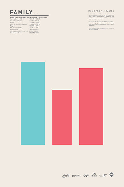
3. Which was the most complex styles to achieve? and why?
The "Family" was the toughest of the four. It was hard to break that down into the simplest form possible. It also ended up looking a bit blocky with the content on the bottom. I needed to contradict my system and move the content from the bottom left to the upper right.
4. For you, what styles are best accomplished? and why?
I usually prefer more of a minimal style, carefully crafting each element.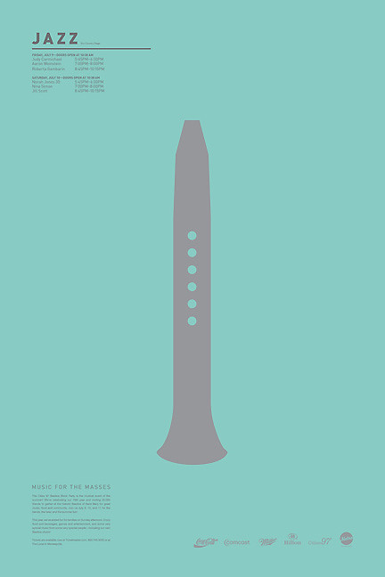
5. How to chose the musical styles?
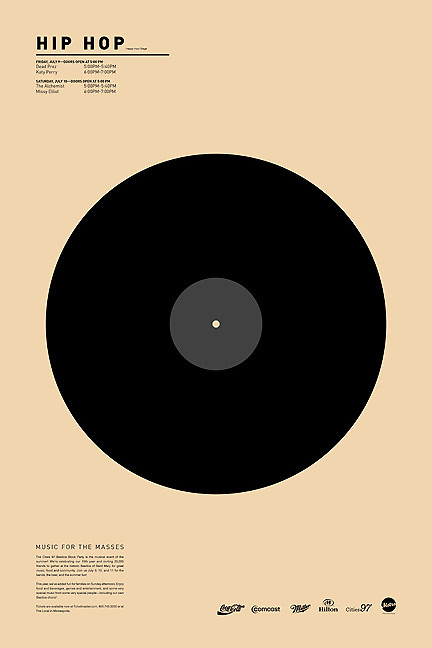
The musical styles were pre-determined in the assignment.
6. You worked with a vector drawing program or pre-made sketches in pencil? Also gave a termination in Photoshop which makes it vintage. Why?
In the beginning, basic scribbles were created in pencil to get ideas out on paper. The illustrations were created in Adobe Illustrator. Everything was laid out in Adobe InDesign using a baseline grid.
7. How long it took to make each of the styles?
This school project had a timeline of one month. This included research, logo design, system experimentation, and critique.

