Lo Mejor 2009: Te presentamos a Mickey Jackson
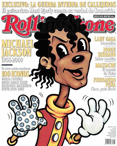
 En julio del año pasado, la versión argentina de la revista Rolling Stone salió a la calle con esta portada, muy distinta para su estilo hiperfotográfico actual.
La ilustración pertenecía a la artista canadiense Anita Kunz. Ella se molesta por el actual estilo cuasi exclusivamente fotográfico que tiene la publicación. "Rolling Stone used to use much more illustration than they do now", sostiene.
En aquel momento, la historia oficial que contaba la revista poco tenía que ver con la versión de la autora. "Rolling Stone wanted to do an article about this major new star, but had no decent photos of him. Somehow he wasn't available to pose for a photograph at that time. And since I had worked for Rolling Stone for many years, Fred (Woodward, director de arte de RS) asked me to try an illustration of him", agrega.
A continuación te presentamos el reportaje completo que le hicimos en exclusiva a Anita Kunz, donde nos contó, entre otras cosas, por qué Jackson se transformó en un Mickey Mouse negro.
1) When you look at your illustration of Jackson recognizes certain style influences. In what inspired you?
Because Michael Jackson at that time was such a cartoon figure (for example sleeping in an oxygen chamber and having a monkey as a best friend) we decided to make him into a Disney character. I worked with the great art director Fred Woodward on this one. I got a Disney book and tried to utilize the way Mickey Mouse for example was drawn.
2) What personal issues you recognized the figure of Jackson to make the picture?
Well again it was just to make a playful image of him as a fantasy character.
3) You told RS that Jackson had been behaving in strange ways. How you managed to translate that view to drawing?
Well at that time it was strange but it was also cartoon like..sort of fantasy like. That's why the Disney reference. It wasn't meant to be mean in any way but rather playful.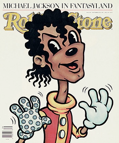
(M. Jackson en la portada de la versión norteamericana de RS, 1987)
4) Which technique used to draw a Jackson?
I sent Fred a lot of sketches which we went over. The trick was trying to make a Disney character but still have it look like him, so I had to utilize the distinctive hair and glove. I painted it in watercolors as I usually do, and then simply added a thick black line around the image.
5) When you did the drawing, Jackson still had his dark skin. Drew, ever, in Jackson with skin clearer?
Yes, I believe I did draw him one or more times later with lighter skin, and a different nose.
6) What you recognize artists as teachers who have influenced?
Oh so many. I think the biggest credit has to go to Marshall Arisman the great artist who really helped me early in my career. And my favorite artist of all time Ralph Steadman.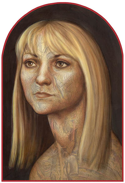
(Autoretrato de A. Kunz)
7) The picture was published, was the only one that you suggested to Fred Woodward?
Well we did go through quite a few sketches to get the finished result. But I worked with Fred regularly for many years, at Rolling Stone and at the other publications he worked at
8) Remember to have received any reaction or any comment from readers about your drawing?
It was so long ago...I don't really remember...sorry. People usually write letters ONLY if they're angry at something. If they like an image they rarely comment!
9) Over the years, Jackson has changed several times. You would draw as it did in 1987 or change something.
Oh no! I definitely would have drawn him differently. His nose changed, his whole face and hair changed. The important thing when doing a caricature is making sure the likeness is good.

