Exclusivo: Quentin Tarantino por Adam Thurland
Mucho ha provocado en el mundo artístico las películas del inglés Quentin Tarantino. Pero uno de las lecturas más interesantes ha sido la del diseñador inglés Adam Thurland, que ha pegado fuerte en la web. 
 "Muy suizo, muy limpio, muy bueno", se puede leer en los blogs de diseño como el catalán City in box. Otros, más arriesgados, hablaban de que los afiches formaban parte de un festival que se pensaba realizar en Austin, Texas, en los cines que te presentamos hace unos meses. Pero estaban mandando fruta. "No, as I said before, the posters where a personal project and designed for a fictional Tarantino festival (meaning they have not been used commercially)", aclara Thurland ante nuestra primera pregunta.
A continuación, en exclusiva para VisualMente, Adam Thurland nos cuenta cómo trabajó en los posters tarantinescos.
1) How could explain each of the colors of Reservoir Dogs and Kill Bill?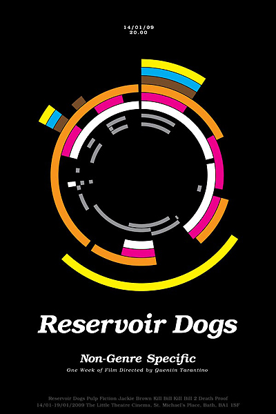
The colours and patterns each represent a character.
Reservoir dogs colours are Mr. White (White ) Mr. Pink (Pink) etc etc. The three grey bands in the middle represent the secondary characters of the film, Nice Guy Eddy, Joe, kidnapped policeman and the second undercover police that helps mr Orange.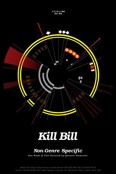
Kill Bill patterns are The Bride (yelow and black) 3 patterns are different snake skins for the three members of the deadly viper assination squad, and Bill is represented by the black and white band of his sword.
Again the the grey bands represent secondary characters.
2) How could explain Kill Bill 2 and Jackie Brown?
These posters are easier to see when you can view the large poster itself rather then on screen.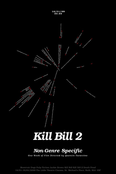
Kill Bill 2 is made up of every sentence in the film script containing the words 'kill' or 'bill', the overall feel is to give an impression of something exploding, as in 'the five point palm exploding heart technique' used by The Bride to kill Bill.
Jackie brown is made up of the first few lines of each character of the film. Where a character appears in a scene, the text is visible, where they are absent then the text is also absent. This leads to a fragmented line of text that when read reveals the characters identity. This was designed to give an impression of the secretive and cunning nature of all the chracters involved in the story.
3) How did it work in this way Tarantino's films?
To start with I am a big fan of Tarantino's films, I have also been very interested in his non-linear style of directing. As a graphic designer this fascination led me to wonder how could it be possible to visualise these films in a linear manner and map the route of the story in the way it is percieved in the mind rather than on the screen.

