.

Lo más buscado en Visualmente::El Norbi en Domestika::Book::Stan Lee, De la A a la Z::Book::Infocomics en italiano::News::El viejo disfraz del nuevo Wolverine::News::El nuevo logo de Superman::News::Entrevista exclusiva con el padre de Deadpool::::Las ilustraciones de El Norbi::Bender Rodríguez::Keith Haring::Astroboy::Batman Black and White::Patone y Perrone::Betty Boop::Mickey Mouse::Spider-Jam::Nuestros Queridos Blogs Asociados::El Norbi::QR Love::Visualmente::Infocomics::BarVisual::Tipográficamente::Universitariamente::Visualmente-Edu::Vía Libre::Bar Uch::Que Bien Que La Estamos Pasando::Los que escribieron en Visualmente, alguna vez::Carlos Gámez Kindelán::Rodrigo Sánchez::Jordi Catalá::Mario Tascón::Jaume Serra::Samuel Granados::Dolores Pujol::Fabio Marra::Luiz Adolfo::Leo Tavejnhansky::Massimo Gentile::Pablo Corral::Angel Casaña::Pedro Pérez Cuadrado::Tomás Ondarra::Kohji Shiiki::Elio Leturia::Rodrigo Fino::Ramiro Alonso::Sergio Fernández::Algunos de los archivos de Visualmente (2005-2013)::Coca-Cola::QR Code Portrait::Vía Libre::Ave María Latina::Odios Tipográficos::Infofreak::Helvética Love::Especial Cooper Black::Creatividad::Caricaturas::Cuartas Jornadas::Cumbre Mundial::Diarios online::Diálogos Visuales::100 Mejores Frases del 2005 (1)::100 Mejores Frases del 2005 (2)::100 Mejores Frases del 2005 (3)::100 Mejores Frases del 2005 (4)::
Nuestras tipografías::Mobype::QR Gothic::Stypenova::Sponge Type::Astroboy Type::Hotel Gonzo::ElectroType::Totoro::Meteoro::Mazinger::Pink Panther Type::

10.8.11

Directo al plexo: Sniffin’ Glue, la quintaesencia del fanzine, a 35 años de su creación

download-1
LucasLópez2(Por Lucas López) > Los fanzines, surgidos a mediados de la década del setenta, fueron la expresión más cruda del llamado movimiento punk inglés, convirtiéndose de la noche a la mañana en lectura obligada de los jóvenes londinenses de entonces. Sus títulos, evocativos y directo al plexo, lo decían todo: Vomit, Situation 3, Rotten to the Core, Live Wires, Ripped and Torn, Trash 77’, London’s Outrage, Zip Vynil, New Pose, Chainsaw y Kill Your Pet Puppy. Pero sin duda, el primer fanzine y acaso el más importante fue Sniffin’ Glue, cuyo primer número, de tan solo cincuenta ejemplares editados, apareció en julio de 1976 en Inglaterra, y continuó durante catorce ediciones, hasta Agosto del '77. Con un título tomado de “Now I Wanna Sniff Some Glue” de Los Ramones, Sniffin’ Glue fue ideado por un empleado de banco desocupado de 19 años llamado Mark Perry, quien firmaba como Mark P para evitar –según decía– la suspensión del cheque de desempleo que cobraba. El primer número de Sniffin’ Glue abría con una bravata que lo decía todo: “La vida apesta. No hablo de aquellos que viven en Devon o en la Isla de Wight, sino de quienes viven en Londres, Birmingham, Manchester o Glasgow. En la ciudad, la vida es terrible. Por eso, este fanzine no es solo para leer, sino también para hundirse es pegamento y oler.” Sniffin’ Glue, que llegó a vender 15.000 ejemplares, enarboló el concepto de prensa alternativa por excelencia, así como sellos del momento como Stiff, Rough Trade, Ilegal Records, New Hormones y Raw definían la noción de sello independiente, financiando, grabando y distribuyendo sus discos por ellos mismos.
download-2
download-3
Con un encabezado de tapa que decía Sniffin’ Glue más otros hábitos del Rock and Roll, los ejemplares eran fotocopiados y abrochados en formato A4 por la novia de Mark Perry en el trabajo y vendidos a 30 libras en un puesto del Soho londinense. Los primeros dos números, a través de un mal tipeado en máquina de escribir, títulos garabateados con marcadores negros, una puesta gráfica desordenada y una resolución absolutamente amateur, enfocaban su mirada en la escena norteamericana como Patti Smith, The Flamin’ Groovies, Television y los propios Ramones, pero fue la explosión punk en Inglaterra la que señaló un cambio drástico en la ajada política editorial de Sniffin’ Glue. Durante el otoño del 76, sus páginas comenzaron a mostrar devoción por bandas como The Clash, Sex Pistols y The Damned, bandas que por el lado de la prensa musical eran absolutamente ignoradas en ese momento, y Sniffin’ Glue las describía desde adentro del propio movimiento musical. Las ventas de Sniffin’ Glue, debido a la irrupción procaz de los jóvenes punks en Kings Road, comenzaron a crecer en gran forma, y Perry se convirtió en una referencia muy importante de la escena, junto a el fotógrafo Harry Murlowsky y colaboradores como Steve Mick y Danny Baker, socios esenciales para la distribución y difusión de Sniffin’ Glue. Por su parte, Perry era el editor, diagramador y redactor. “Teníamos un gran entusiasmo por la música. Pero nunca idolizábamos a ningún grupo. Recuerdo una entrevista con Johnny Rotten en la cual lo acusábamos de grabar Anarchy in the UK sólo para vender remeras "Anarchy" en el negocio de Malcom McClaren”, recuerda Perry. Un artículo muy recordado, en una de sus últimas ediciones, le daba a los lectores consejos de cómo lograr su propio fanzine, “para inundar el país con literatura punk.” En pleno movimiento, todo aquel que no había logrado tocar uno o dos tonos de guitarra o bajo, había tomado una birome o una máquina de escribir, según un slogan que define el espíritu de época. Y en parte sucedió gracias al punkzine. “Sniffin’ Glue fue pirateada en todo el mundo" –dice Perry–, "Blondie me dijo una vez que en New York se la podía conseguir en papel rosa, lo cual no tenía nada que ver la nuestra". El número final de Sniffin’ Glue, el 12, apareció en agosto del 77’, incluyendo un disco flexible gratis de “Love Lies Limp” de Alternative TV, la banda con la cual Mark Perry había comenzado a ser identificado. A fines de la década llevó adelante Step Forward, un sello en el cual The Fall, Sham 69 y Chelsea and The Cortinas grabaron su primer disco. En 2000, la editorial Sanctuary Books publicó Sniffin' Glue, El Accesorio Punk Esencial, que compila todos los números del fanzine, junto a nuevas notas y fotos. Por su parte, la especialista en el tema Teal Triggs editó en 2010 el excelente libro Fanzines, que compila gran cantidad de material visual, entre ellos, el definitivo e inconseguible Sniffin’ Glue.
download

Exclusivo: La Helvética nació en 1961, como El Norbi

NeueHaasGrotesk_01
El sábado pasado, El Norbi cumplió 50 años. Existe una tipografía muy conocida que también nació ese año. Si bien se identifica a la tipografía Helvética con el año 1957, su verdadera fecha de nacimiento no sería otra que 1961.
La historia cuenta que la tipografía Neue Haas Grotesk había sido desarrollada por Max Miedinger en 1957 y respondiendo al encargo de Edouard Hoffmann, de la Fundición Haas. La idea era modernizar el estilo del tipo sin serifa de la casa, que no era otra cosa que una familia basada en la Akzidenz Grotesk de la Fundición Berthold, de finales del siglo XIX.
Ya remodelada por la dupla Miedinger-Hoffman, la nueva creación, la Neue Haas Grotesk mantendrá ese nombre hasta 1961, momento en el que la Fundición Stempel adquiere la Fundición Haas. Y es en este preciso momento, en que la Neue Haas Grotesk se empieza a llamar “Helvetica” (del latín, “suiza”).
Además, del nombre, este año debería ser tenido en cuenta porque los nuevos dueños deciden recién ahí desarrollar una serie completa, con diferentes pesos.
Hace un tiempo, El Norbi le pidió a sus estudiantes que trabajaran sobre ésta tipografía como si fuera un producto y la Fundición Stempel como cliente. en este trabajo se trabajó sobre aspectos no sólo tipográficos sino también ceativos publicitarios.
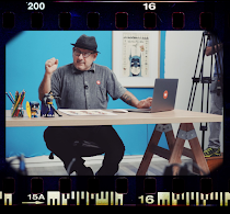
Los estudiantes se habían dividido en duplas creativas, donde algunos eran directores de arte y otros eran redactores. El producto era la tipografía que festejaba su primer cincuentenario de creación. La Helvética dejaba de ser un instrumento y se convertía en un producto en sí para comunicar.
El brief sostenía que las piezas deberían ser tipográficas, cosa que aumentó aún más el riesgo. Las piezas como el espíritu de la tipografía debían manejar ciertos conceptos de sobriedad y limpieza.
H3
(De Yanina Arabena y Laura Banchik)
......................
H2
(De Alejandro Goldín y Paulina Germán Freire)
......................
h1
(De Macarena Paradelo y Flor Espinoza Merchán)

7.8.11

Exclusivo: El sueco Viktor Hertz nos presenta sus Pictogram Music Posters

Imagen 103
En abril pasado, te presentamos, en primicia latina, al diseñador sueco Viktor Hertz quien se había metido con los íconos típicos que se usan en los baños para hacer sus afiches de cine. En aquel momento, nadie lo había entrevistado, pero todos los blogs habían copiado y pegado sus versiones de famosas películas. Hoy aumentamos la apuesta y antes de que sean un éxito en las redes, te presentamos los "Pictogram music posters", lo último de Hertz. Y, como no podía ser de otra manera, no sólo te los mostramos, sino que entrevistamos, por segunda vez, a su creador, en exclusiva para Visualmente.
Imagen 107
Imagen 102
1) How the idea for "Pictogram music posters"?
A long time ago, I had an idea of making posters out of songs, but not by using pictograms. I never made these posters, and then my mom actually told me I should make music posters, and I thought the most appropriate way to do them was using pictograms. Si querés ver más Pictogram Movie Poster, entra ya a Chillart, el blog de arte de Visualmente.

2) How you relate to your previous Pictogram Movie Poster?
It’s the exact same idea, but song titles instead of movies. That’s it. I wanted these to differ from the movie posters, though, so I just experimented with a different texture and background. I did keep the centered Helvetica font, continuing with the simple approach and aesthetics.
Imagen 99
3) How did you get your version of Highway to hell?
It began with being reminded of the song, or maybe I was just looking at the symbol for the autobahn, I can’t really remember now, actually. But it seemed appropriate, so I played around with different versions of a trident, and finally came up with this draft. I thought the best symbol depicting hell was a trident, in this case.

4) Which of all the new posters was the most complicated?
It was actually ‘Highway to hell’, which I described in the previous question. It took quite a while to get it right, making the trident look good, and not get too far away from the original pictogram. It was also the most fun to make, and even one of the posters I am most happy with. So, it was worth the effort, I guess.
Imagen 101
Imagen 98
5) How long did it take to make the posters?
I’ve had them finished on my computer for quite a while, going back and polishing from time to time. Some of the posters are done very quickly, because the idea behind it didn’t need that much work to get it realized. But in general, they are all made quite quickly, they are not advanced, most of the time behind them are put on coming up with an idea for a poster that could be fun. So, it’s hard to tell exactly how much time each takes. Sometimes, I think about the ideas quite long before I put myself in front of the computer and make them, and sometimes I just stare at pictograms and play around with them, until something cool comes up in my head.
Imagen 100
6) You make a pencil sketch and then do it in Illustrator to finish it in Photoshop?
No, I make my sketches directly in Illustrator, almost all the time. It happens that I use a sketchbook, but that’s just when I don’t have access to my laptop. I finish it in Illustrator, too, using texture layers on top of my design.
Viktor-Hertz
7) Why did you choose this kind of aesthetic, almost infographic for these posters?
Because I like that style, myself. And I think my strength is to make simple stuff, focusing on an idea, rather than making a cool poster filled with all kinds of stuff. I will try to leave the pictograms some time, and develop other ideas, of course, but for now, I really can’t give up on them. I’m stuck with pictograms, at the moment. But I love it.

Exclusivo: Primeras imágenes del Cincuentenario de El Norbi

Imagen 91
Ayer, pasadas las 17.28, se sirvió un vino de honor en la redacción del diario Tiempo Argentino. Esto era parte de un evento muy especial para uno de sus trabajadores. Es que El Norbi cumplía sus primeros 50 años ese día. Por tal motivo hubo sandwiches de miga de pan blanco y pan negro con amplias variedades de combinaciones, siendo número puesto su debilidad, el jamón crudo. El vino, Latitud 33, en sus varietales Sirah y Cabernet, fueron servidos en divertidas copas de plástico similares a las utilizadas en cumpleaños preadolescentes. Los vasitos con imágenes de los Simpson fueron los más solicitados.
Imagen 88
Imagen 92
Imagen 93
Imagen 85
Imagen 95
Imagen 87
Imagen 94
Imagen 96
Imagen 86
Imagen 90
Imagen 97

4.8.11

Exclusivo: Stéphane Massa-Bidal en Visualmente

5
Te habíamos contado que íbamos a entrevistar al francés Stéphane Massa-Bidal, creador del proyecto ”Retrofuturs”, mix entre el pasado, el presente y el futuro, con una poderosa pátina vintage. Lo que empezó siendo un simple juego en Flickr, después fue un boom en las redes sociales. Pero ningún medio latino lo había entrevistado hasta hoy. En exclusiva, Stéphane Massa-Bidal en Visualmente.
1. How would you define this project of yours that is gaining attention in both social networks called Retrofuturs?
Social networks are not an end in itself in my work. This is only part of my graphic work, and as I work in social networks, it helps me to understand these technologies and especially the digest.

In fact, I work more on the report "real life / digital life": how social networks integrate our lives or vice versa, what are our body parts in interaction with the media, how to conceptualize the songs of Elvis Presley and networks social or even how to represent Apple's products in relation to the body for example.

In this framework, I try to identify relationships when I find an interesting idea to dig. I listen and I read a lot about the uses of technology. Most of the ideas that I illustrate graphs are the result of collisions that come with attention to some points of discussion.

2. How an idea? First sketches on paper, then work with Photoshop?
My ideas are surely the most striking by far, because they take me like that. My brain works in secret, in hidden time some would say.

I only work on screen, I do not draw, I try instead to build the image with what she told me by testing several tracks.
facebook
flickr
(Si querés verYoutube, Twitter, MySpace y LinkedIn, entrá a Chillart)
3. How did the idea to do some book covers for Facebook, Twitter, Flickr and YouTube?
I was to get my daughter who was finishing his nap, when crossing the corridor, I thought: "What if social networks are book covers?". I had for some time wanted to work Penguin book covers. I mounted the pictures and documented the accompanying text, in two days, it was done.
Darth Vader _ Dark Vador_monroe_warhol (repost)6757281505627033397
4. How did you get the Vader Warhol?
Darth Vader with Marilyn Monroe as Andrew Warhol, a missing piece of the image processing for Warhol. In fact, I think I got the idea while thinking of Marilyn Monroe, Mao and Warhol. Darth Vader as well deserves its head in the style of Warhol, I think I made him happy ...

In fact, Darth Vader and Marilyn Monroe are icons that I enjoy working, I have therefore combined.
CMJN de base
CMJN de base
(Si querés ver más cambios tipográficos, entrá a Tipografícamente)
5. What is the project the Wor (l) d to have changed?
This series was born as a result of an old image I had done two years ago: Sex, Toys and Rock'n Roll. As I shall later question 9, I work more on textual aspects of late. The idea is to replace or change an item, it changes the paradigm in which it is and find its value (substitution principle to find a value in structural assembly) and given to understand that some aspects of society evolves.

6. What do you mean by this sentence: "The graphics are a tool to change your mind"?
When I started to make some pictures, I was often struck by images without meaning, a lot of effects, pretty things, but really, why?

Because of my training, I look for meaning, to build relationships, to try to understand what makes us better consumers to swallow. In this sense, I work sometimes some images (Monsanto, marketing, cancer, Apartam, climate change ...) I even made an album on my Flickr, it is to say!

In fact, that I denounce, everyone knows, I am even well below the reality ...

6. What are your influences aesthetic?
Futurism, the 50, 30, collage, pop, black humor (the French Hara-Kiri) and René Magritte.
347
622
7. Tell us how you work in this special series with Helvetica, showing landscapes and figures.
As I have said before, I like the work of René Magritte. Also, I tried to work as a principle of substitution: replacing an architectural feature in a landscape, like a passage. With this in mind have grown up the numbers, like the gates of Stargate.
-1
8. What are your plans now?
I manipulate the images vintage least for now, I reserve for commisioned works.

I post pictures of a little less because I'm working on three large personal projects simultaneously, and they are quite different from those I made earlier.

I work a lot more now on the text, and the series "The wor (l) d HAS changed" is the first effect.

In a way, I return to my first love is literature that the ratio of words of text and slogans in our society. With this in mind, I developed two major projects:

The first major project called "the medium is the message" I accept texts in different formats suited (shorts, boxers, t-shirts and aprons);

the second is more like UFO literary texts I work erotic writings under stress (like the "Exercises in Style" by Raymond Queneau). I plan and conduct a book written and illustrated with my own way.

Third and last major project: "Viva la geolocalización" (also known as "G project").

My biggest graphic design, which I worked for over six months, where I am designer and artistic director. I joined a very good friend and graphic designer to finalize look more shown for this project. I do not know yet what will be its final form but it will certainly be declined as a book, exhibition, posters and products.

2.8.11

Último momento: Este lunes, Pictogram Music Poster, lo nuevo del sueco Viktor Hertz

5609815100_b9df34c818
En abril, te presentamos, en primicia latina, al diseñador sueco Viktor Hertz quien se había metido con los íconos típicos que se usan en los baños para hacer sus afiches de cine. Por ejemplo, para hacer un afiche de la última película del norteamericano Quentin Tarantino, Hertz hizo algo bastante iconográfico.
Uno pudo ver al diseñador bonaerense Raúl Della Valle, coeditor de Chillart, contarnos una historia de amor con esos mismos íconos. Otro coeditor de Chillart, el diseñador español Federico Fuertes Guzmán también nos mostró cómo reconocer siete lugares en el mundo, usando el mismo recurso pictográfico.
Este lunes, en un reportaje exclusivo de Visualmente, el diseñador sueco Viktor Hertz nos hablará de su nueva obra Pictogram Music Poster, que no es otra cosa que traducir a la iconografía de muñequitos del baño temas clásicos del rock.
Si querés ir conociendo un poco el trabajo de Hertz, entrá ahora a Chillart, para ver el reportaje anterior y la presentación exclusiva de sus Pictogram Movie Poster.

works::astroboy

works::en vía libre

works::en metrópoli

type::mobype

type::stypenova

works::helvetica gothic

news::superman 2025

news::deadpool

news::Wolverine

works::japan

type::qr gothic

type::bob esponja

type::astroboy

type::big time

type::meteoro

type::pink

type::totoro

type::batman japan

THE QR SERIES

THE QR SERIES
El MIQR-EY MOUSE

LA PUQRA

Merry QRistmas

El Bender Baruch

kid works:: batman

kid works::superman

kid works::bender

kid works::wolverine

kid works::deadpool

kid works::iron man

kid works::spider jam

kid works::captain america

Archivo VisualMente

Mi vieja era de Boca

Mi vieja era de Boca
Especial Boca Juniors