.

Lo más buscado en Visualmente::El Norbi en Domestika::Book::Stan Lee, De la A a la Z::Book::Infocomics en italiano::News::El viejo disfraz del nuevo Wolverine::News::El nuevo logo de Superman::News::Entrevista exclusiva con el padre de Deadpool::::Las ilustraciones de El Norbi::Bender Rodríguez::Keith Haring::Astroboy::Batman Black and White::Patone y Perrone::Betty Boop::Mickey Mouse::Spider-Jam::Nuestros Queridos Blogs Asociados::El Norbi::QR Love::Visualmente::Infocomics::BarVisual::Tipográficamente::Universitariamente::Visualmente-Edu::Vía Libre::Bar Uch::Que Bien Que La Estamos Pasando::Los que escribieron en Visualmente, alguna vez::Carlos Gámez Kindelán::Rodrigo Sánchez::Jordi Catalá::Mario Tascón::Jaume Serra::Samuel Granados::Dolores Pujol::Fabio Marra::Luiz Adolfo::Leo Tavejnhansky::Massimo Gentile::Pablo Corral::Angel Casaña::Pedro Pérez Cuadrado::Tomás Ondarra::Kohji Shiiki::Elio Leturia::Rodrigo Fino::Ramiro Alonso::Sergio Fernández::Algunos de los archivos de Visualmente (2005-2013)::Coca-Cola::QR Code Portrait::Vía Libre::Ave María Latina::Odios Tipográficos::Infofreak::Helvética Love::Especial Cooper Black::Creatividad::Caricaturas::Cuartas Jornadas::Cumbre Mundial::Diarios online::Diálogos Visuales::100 Mejores Frases del 2005 (1)::100 Mejores Frases del 2005 (2)::100 Mejores Frases del 2005 (3)::100 Mejores Frases del 2005 (4)::
Nuestras tipografías::Mobype::QR Gothic::Stypenova::Sponge Type::Astroboy Type::Hotel Gonzo::ElectroType::Totoro::Meteoro::Mazinger::Pink Panther Type::

7.6.07

(t) "I like to look of Gotham"

kristin1
(Kristin Lenz, directora de arte del diario norteamericano Hartford Courant)
Qué tipografía: 1) Usas frecuentemente? (Por qué?)
1) I frequently use interstate and minion, because those are the two most prominent fonts we use at the courant. news fronts take a combination of weights of minion for headlines, nimrod for body copy and poynter for refer text, bylines, cutlines, etc. interstate is introduced in our features sections, and is the primary hed font there.
2) Prefieres? (Por qué?)
2) I prefer fonts like helvetica neue, but use it mostly on freelance stuff. we don't use it here at the paper. i like to look of verlag, gotham, some weights of miller.
3) Odias? (Por qué?)
3) I don't think there are any fonts i dislike. there's always a place in the world, somewhere, for a font shaped like circus animals. just not anywhere in my world.

works::astroboy

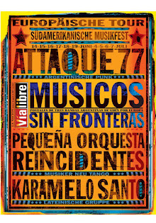
works::en vía libre

works::en metrópoli

type::mobype

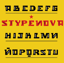
type::stypenova

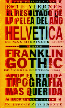
works::helvetica gothic

news::superman 2025

news::deadpool

news::Wolverine

works::japan

type::qr gothic

type::bob esponja

type::astroboy

type::big time

type::meteoro

type::pink

type::totoro

type::batman japan

THE QR SERIES

THE QR SERIES
El MIQR-EY MOUSE

LA PUQRA

Merry QRistmas

El Bender Baruch

kid works:: batman

kid works::superman

kid works::bender

kid works::wolverine

kid works::deadpool

kid works::iron man

kid works::spider jam

kid works::captain america

Archivo VisualMente

Mi vieja era de Boca

Mi vieja era de Boca
Especial Boca Juniors