Exclusivo: Hablamos con Mark Todd
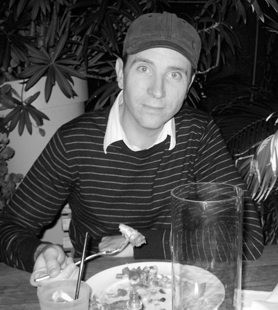
 Perdonen la tardanza, pero todo llega. Hoy te presentamos al ilustrador norteamericano Mark Todd que ha hecho hablar a màs de un blog con sus recreaciones comiqueras.
1) How you chose the covers of comic magazine?
i chose covers i love. covers i can see altered in a interesting way. covers by jack kirby are by far my favorite.
sometimes i choose covers of comics that i remember owning as a teenager, ones that provoke a memory or an emotion.
2) Which technique used to achieve closer to the original font?
once in a while the fonts are transfered down and painted. but most of the time they are just done freehand.
i love type and i enjoy trying to mimic certain fonts, especially the fantastic four title. its such a beautiful script.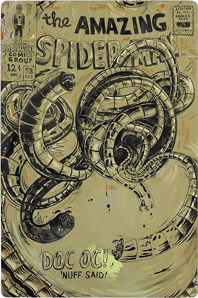
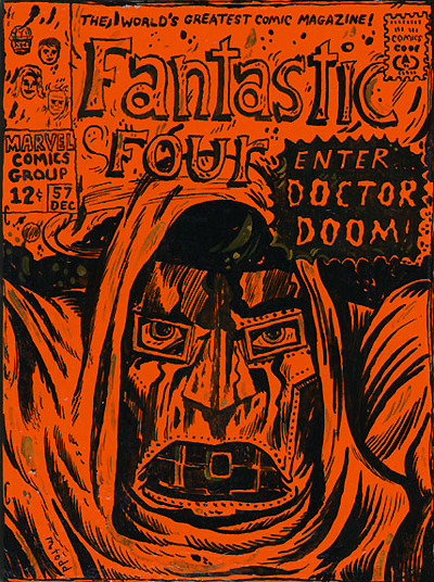
3) How was the choice of colors in the covers of Doctor Doom and Doc Oc?
colors are made based on the mood i want to project onto the pieces. a lot of the color choices are in direct contrast to the original cover art color choices, pinks and neon oranges for example. i like changing the colors dramatically, helping to modernize the painting and emphasize the alterations from comic cover to original art. other times i like to mimic the colors of the comics more directly. it just depends on the mood i'm in and how i feel about the cover at that time.
4) On the cover of Demolisher (Iron Man magazine), You use an aesthetic style that is reminiscent of a Jean-Michel Basquiat. This artist has exerted some influence on you?
yes, i suppose so. basquiat was a favorite of mine early on in my career and was probably more apparent then. his linework was beautiful. these days, i am drawn more to artists like Guston and Donald Bachelor.

