
Exclusivo: El creador de la Tabla Periódica de Tipografías

 1) How did they relate the periodic table of elements with the fonts?
The Periodic Table of Typefaces actually does not correspond nor relate to the Periodic Table of Elements except for overall visual similarity. The Table of Typefaces is meant to only look like the Table of Elements at a glance, then the view looks closer and realizes that it is typefaces they are looking at and not elements at all! If you overlay the Table of Typefaces with the actual Table of Elements you can see that they do not "match up" at all.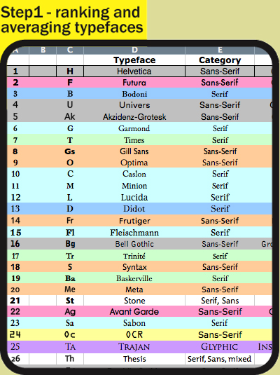
2) How was the process of selecting the fonts to be part of the new table?
All the sources are listed at the bottom of the design.
Here they are:
The 100 Best Fonts Of All Time -
http://www.100besteschriften.de/
(to include top ten personal favorites from designers:
* Jan Middendorp [dorpdal.com]
* Roger Black [rogerblack.com]
* Bertram Schmidt-Friderichs [tdc.org]
* Stephen Coles [typographica.org]
* Veronica Elsner [www.fontshop.com/fonts/foundry/elsner_flake/]
* Ralf Herrman [opentype.info]
* Claudia Guminski [fontshop.com])
Paul Shaw’s Top 100 Types survey -
www.tdc.org/reviews/typelist.html
21 Most Used Fonts By Professional Designers -
www.instantshift.com/2008/10/05/21-most-used-fonts-by-professional-designers/
Top 7 Fonts Used By Professionals In Graphic Design -
justcreativedesign.com/2008/09/23/top-7-fonts-used-by-professionals-in-graphic-design-2/
30 Fonts That ALL Designers Must Know & Should Own -
justcreativedesign.com/2008/03/02/30-best-font-downloads-for-designers/
Typefaces no one gets fired for using -
www.cameronmoll.com/archives/001168.html
(to include all serious and reasonable opinions stated in the comments section)
I basically used an Excel spreadsheet and started entering in which typeface was on any of the lists from the sources. I then ranked the typefaces I had in the spreadsheet matching the rankings from the source website lists. I averaged all the rankings for each typeface and included the number of times each particular typeface appeared on the lists. Finally I had a total average score for every typeface. I simply selected the first 100 to incorporate into my designed table.
So essentially, I DID NOT choose the typefaces, I simply selected through statistics and averages the most popular and influential typefaces in use today based on the above lists!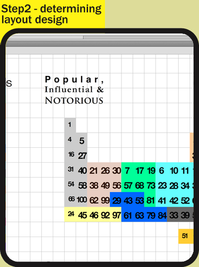
3) What fonts were excluded from the selection? Why?
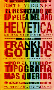
Comic Sans was most certainly NOT on the list! Again, I had no part in the actual selection process or rank except that I averaged and combined the existing, reputable lists. Some comments I found asked why there aren't any more commonly used fonts on the list such as Arial, Georgia or Cambria. Again, simply because they were not on the source lists. Arial is only a copy of Helvetica with a few minor differences, so I don't see it ever being on any sort of professional-based lists in the future. Georgia and Cambria are definitely gaining in popularity so perhaps next year they may be seen on "Popular Typeface" lists more often.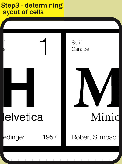
4) What impact do you know that has caused its creation in the world?
This is a good question. I honestly had no idea there would be this sort of impact. I posted this originally on Behance.net just to see if I could get any critique or feedback from the other Behance members. The original post was put up Monday evening, 9 March. By the next morning, the page views for the design was at 5,000! In only the last 4 days, the Behance project views for the design is up to 29,000 and slowly rising. I had no idea this design would generate this much interest! All I wanted was a cool print to hang on my wall!
To attempt to answer your question though, I hope that it will further the awareness of the common user what typographers and most designers already know - that typography has a long and beautiful history and that the typeface you decide to use in a project, whether it be a letter to a friend or a professionally designed advertisement, the typeface you choose makes a big difference in the impact of your work.
5) What you feel to have put order into chaos as typographical Mendeleyev table with your other?
As already stated, the intention is for the design to only look like a traditional periodic table of elements at a glance. The order of the Periodic Table of Typefaces is only by the family and class groups of the typefaces. As you can see upon close inspection, the ranking order is disjointed. I would have had to completely sacrifice the overall look of the table if I would have placed the typefaces in family/class order AND numerical rank order. Unfortunately, the Periodic Table of Typefaces greatly lacks in the aesthetics of Medeleyev's table. Medeleyev was a much smarter man than me!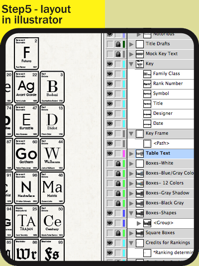
6) How long you worked in the typographic design of the table?
I started the process of sorting and averaging the typefaces used several months ago. I would work on it periodically when I was bored or feeling motivated. Once I had the top 100 typefaces in my list (again, only averaged from the source lists) did I start the design of the table. I first categorized and researched all 100 typefaces and noted the designers and the years designed. Then in I started out with a simple grid in Adobe Illustrator. At one point I used Flash to create the grid layout by color coding boxes based on the family/class with the numbers noted in each box. I then determined the layout by dragging the boxes around in Flash until I found a layout I could live with. Then I went back into Illustrator and started building the cells one by one within the grid. Finally I copied all the finished cells into Photoshop and made the aged, textured background. See attached screenshots for my disjointed process!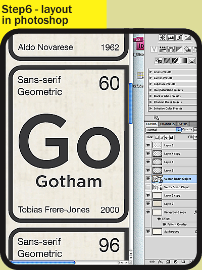
I'm flattered and overwhelmed by all the attention this design has generated. Let it be announced here that I will be soon providing a fully-scalable .eps file for whoever wants it (to print themselves) for whatever price they feel comfortable with. They can pay $0 or $50, it will be entirely up to them.


+15.06.00.png)