Merry QR-istmas


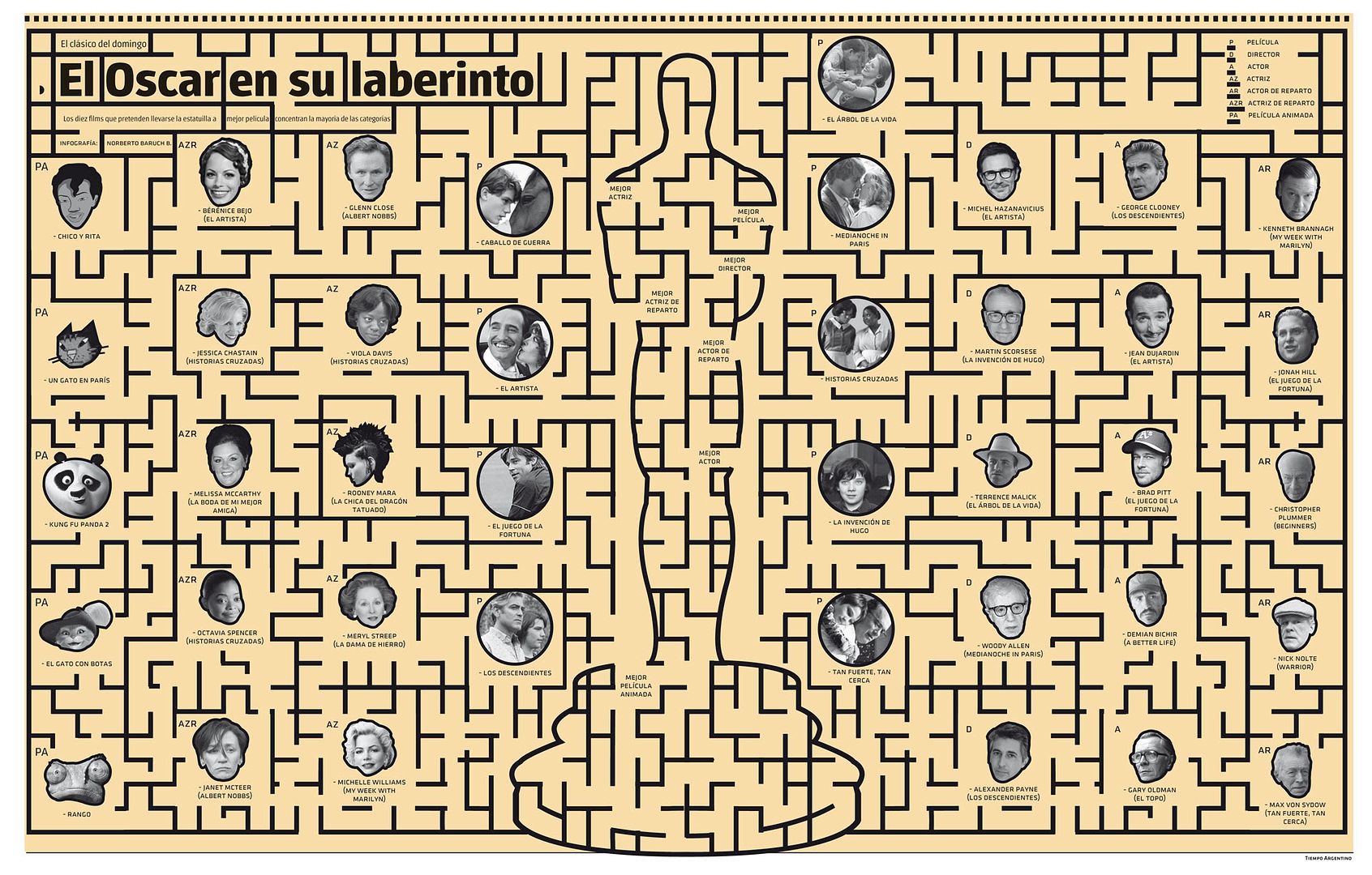
(Hacer click sobre la silueta del Oscar, para agrandar)
Hoy los diarios tienen una nueva oportunidad para hacer algo distinto. Siempre los departamentos de infografía se enfrentan a noticias cíclicas como la de la entrega de los premios Oscar de esta noche. Porque es realmente imposible que el lector dominguero no quiera enterarse de cuáles son las candidatas a mejores películas, cuáles son los considerados mejores directores y cuáles serían los actores y actrices capaces de alzar el trofeo.
Ese desafío anual generalmente no es tomado como tal y lo que se recibe en las páginas de espectáculos no suele superar la típica gráfica de doble entrada propia de los suplementos económicos, como las candidaturas y las categorías premiables.
Pero hoy un diario intentará hacer algo distinto.
Siempre El Norbi ha tratado de hacer algo más o menos creativo con este tema repetitivo, cuasi aburrido. Por eso, para hacerlo menos previsible, hoy publicó una nueva infografreak a doble página, en el centro del suplemento de ES (Espectáculos) del diario Tiempo Argentino.
Allí aparecen las principales categorías repartidas como si fueran parte de elementos que tratan de llegar a un lugar, como si fuera un laberinto. Como esos que uno busca en diarios y revistas para unir con una lapicera.
La idea original se enfrentó con la realidad y fue complicada realizarla. Hasta último momento del cierre, El Norbi creyó que no se podía hacer.
En primer lugar, y a diferencia de los laberintos impresos, todos los candidatos (elementos) tendrían que tener la posibilidad cierta de llegar hasta el Oscar. Luego eran necesarias las típicas trampas visuales que estos juegos tienen para mantener el espíritu deportivo. Lo que si fue un agregado interesante fue tratar de complicar visualmente la salida del trazo de algunos nominados para demostrar que los mismos no eran candidatos a ganar la estatuilla.
Ahora, podés descargar la infografreak de los Oscar para jugar. Hacé click aquí.


1. How this project is born pop / geek culture illustration?
Well, it started as something different, actually. I did the Animals set first. The original goal was to see how few geometric parts I could use to make an animal face... with the intent of then seeing how few parts I could replace to make a different animal face. I started with a Cat & Dog as my baseline. Then, it became about finding the essence of each animal... that thing that made them unique. So once I had a Cat, I could add stripes to make a Tiger, or spots to make a Leopard. A Horse and a Zebra are the same except for the pattern. And so on.
So, once I had the basic building blocks it was easy. I did Star Wars next as a way to challenge my visual system to something beyond animals, and it worked really well. So once that set was done, I just went crazy drawing any pop culture thing that I could think of.
2. I worked to achieve such a synthesis? Which illustration was the most complicated?
The synthesis comes from being really strict about certain details. For example, the eyes very seldom change... and when they do, it is absolutely necessary. There are some basic rules I have for head size, hair size, helmet size. There's some standard parts for things like ears, horns, beards, etc. I have a palette of about 20 colors which everything conforms to. Basically, the amount of variation that is achieved in these illustrations is only possible because of the rigidity of certain parts of the visual system. That really was the entire reason for doing this... to see how many variations I could make with a fairly limited set of parts.
As for which were the most complicated... there emerged a few things that made certain illustrations more difficult.
Some were challenging because the original character was already so stylized. Take Spongebob or Daffy Duck. There is only so much you can do to change a character when their shape and style is what identifies them. So I did the best I could at unifying by using my patterns, but with a bunch of new parts. Sometimes it was the proportion or ratio of the original character that caused the problem. Anyone with a tall head or hat was very difficult.
Others were challenging because there was so much detail. For example, Darth Maul has these really elaborate facial tattoos. So how do you simplify that down to basic shapes while still retaining the feel of them? It's actually really difficult to find that balance. But in the end, having too much detail is good, because you have a lot to choose to focus on.
Without a doubt the most challenging ones were when I had virtually no detail to work with. The more non-descript a character is, the harder it is to simplify them down to their essence. No question, the most difficult set overall was the U.S. Presidents. Here we have 43 characters, which save for Barack Obama, are all basically old caucasian guys. They aren't superheroes. They aren't creatures. They are just guys. So the only thing I had to work with was the hairstyle. This led me to a really wonderful little "coding" with this set. Their mouth gesture is code. A sad face meant that they were assassinated. A frown meant someone tried to assassinate them. A smirk meant that they were involved in controversy. You will then notice that these mouth gestures get used elsewhere. For example, Aerith from Final Fantasy was killed, so she has a frown. It became a really fun little detail that was born from a severe limitation.
3. What was the criterion for selecting the characters?
I chose sets based on things that I liked. In general, everything I illustrated was something that I personally enjoyed... be it a toy from my childhood or a current TV show. I think the one that was most fun for me was Masters of the Universe, which I did as my fourth set. I had every MotU toy as a kid... and I'm not exaggerating either, I had every one. But, in the end, I had done pretty much everything I could think of anyhow, so the order I chose them didn't much matter.
4. How long it took to do this work?
I did the Animals set in August and the last upload was in November. So, I guess no longer than 3 months to do them all. It got easier and faster as I went on. By the end I had pretty much every part already drawn, so it was just a question of remembering where I had drawn it. I doubt that anyone would ever guess it, but these are all drawn in Adobe Fireworks. Not to sound immodest, but I'd challenge you to find someone who is faster in Fireworks than I am :P So, it just became a really smooth process after a while.
5. What is the picture that you like best? Why?
I have many favorites, which I actually have kept track of over the course of making 1280 of these. But I'll try to respect the spirit of your question and pick just one. So If I had to name just one illustration as the best, I guess I'd go with Anakin Skywalker's Redemption. It's not the most complex one, but this illustration is loaded with subtext. The little mouthpiece element reminds you that this is Darth Vader. It's from an extremely powerful movie scene in which the events of three films culminate in the redemption of the villain. I don't know, I guess this one just tells a story or evokes a memory in the way many of the others do not. And something just makes me chuckle about seeing sad or evil characters looking all cute in these illustrations.






 Creado por El Norbi Baruch y Dolores Pujol, VisualMente es el blog de periodismo visual de latinoamérica. Si bien su origen es argentino, desde el principio, en febrero de 2005, el blog ha sabido sumergirse en la realidad visual del continente.











+15.06.00.png)