.

Lo más buscado en Visualmente::El Norbi en Domestika::Book::Stan Lee, De la A a la Z::Book::Infocomics en italiano::News::El viejo disfraz del nuevo Wolverine::News::El nuevo logo de Superman::News::Entrevista exclusiva con el padre de Deadpool::::Las ilustraciones de El Norbi::Bender Rodríguez::Keith Haring::Astroboy::Batman Black and White::Patone y Perrone::Betty Boop::Mickey Mouse::Spider-Jam::Nuestros Queridos Blogs Asociados::El Norbi::QR Love::Visualmente::Infocomics::BarVisual::Tipográficamente::Universitariamente::Visualmente-Edu::Vía Libre::Bar Uch::Que Bien Que La Estamos Pasando::Los que escribieron en Visualmente, alguna vez::Carlos Gámez Kindelán::Rodrigo Sánchez::Jordi Catalá::Mario Tascón::Jaume Serra::Samuel Granados::Dolores Pujol::Fabio Marra::Luiz Adolfo::Leo Tavejnhansky::Massimo Gentile::Pablo Corral::Angel Casaña::Pedro Pérez Cuadrado::Tomás Ondarra::Kohji Shiiki::Elio Leturia::Rodrigo Fino::Ramiro Alonso::Sergio Fernández::Algunos de los archivos de Visualmente (2005-2013)::Coca-Cola::QR Code Portrait::Vía Libre::Ave María Latina::Odios Tipográficos::Infofreak::Helvética Love::Especial Cooper Black::Creatividad::Caricaturas::Cuartas Jornadas::Cumbre Mundial::Diarios online::Diálogos Visuales::100 Mejores Frases del 2005 (1)::100 Mejores Frases del 2005 (2)::100 Mejores Frases del 2005 (3)::100 Mejores Frases del 2005 (4)::
Nuestras tipografías::Mobype::QR Gothic::Stypenova::Sponge Type::Astroboy Type::Hotel Gonzo::ElectroType::Totoro::Meteoro::Mazinger::Pink Panther Type::

17.1.12

Lo Mejor 2011: Hablamos con el ingles Christian Wildgoose. creador de un comic book para los Hermanos Coen

true_grit_poster_01
Imagen 75
El 4 de febrero de 2011 le hicimos un reportaje exclusivo al artista inglés Christian Wildgoose, quien trabajó en una poderosa adaptación gráfica de la última película de los Hermanos Coen. Esa historia de vaqueros, bien machos, y de una pobre niña de 14 años que ve como unos forajidos masacran a su familia, tendrá su lugar nuevamente en las jornadas de bostezo y sonrisas de los Oscars.
Diez nominaciones tiene True Grit y puede ser la gran sorpresa de la noche. Pero antes del estreno en los cines de Buenos Aires, te presentamos lo que nadie te ha presentado. Le hicimos un largo reportaje a quien trabajó con la Paramount y los Coen para lograr al mejor sheriff Rooster Cogburn, muy parecido al actor que lo caracteriza en el film, Jeff Bridges. El reportaje despues se convirtio en una doble pagina del diario Tiempo Argentino. Para conocer esa version, entrá ahora en Chillart.
download
1. Why did someone think about you for drawing the True Grit Comic Book?
I got the job on True Grit because of a sketch i put up on my Blog of Jeff Bridge's Rooster Cogburn (this is the sketch on my blog: http://christianwildgoose.blogspot.com/2010/11/true-grit-first-of-sktches.html)
I had just watched the trailer and really wanted to draw him because he looked pretty badass, especially the shots of him toting his gun with his overcoat blowing in the wind.
So i drew up this sketch and luck would have it that within a week the sketch had been noticed by somebody working for Paramount who had a short comic in mind for the promotion of the film. they asked me if i was interested in submitting the sketch with the script. pretty much the next day we had Paramount asking if we would come to the offices for a screening of the film and to talk about doing this comic.
Imagen 4
2. With regard to technique, how you work? First there were sketches in pencil, then Illustrator?
Typically i approach a comic with tiny thumbnail sketches of the whole comic, working out the layout and composition of the panels, then size up the comic to the size of about A3 and do tighter pencils with a blue pencil and then tighten up more with a lead pencil, because there was such a tight deadline to get it done, i drew the whole thing in pencil in one go, then scanned it into the computer converted the pencils to a blue colour and printed them out onto Bristol Board and then started inking.
With the Inking I decided to take a gamble. usually I ink with just pens but I decided to try inking TG with a brush and india ink. I had never used a brush to ink before purely because I was quite uncertain of myself but this whole project seemed to be about taking gambles so i thought to hell with it. i think it paid off. its not perfect by any means but I gave it the best shot i could, I think i'll be inking with a bush from now on through because it was quite satisfying.
After Inking i scanned in the whole thing again and pieced the comic together using Photoshop and added some greys to add a bit of depth.

Imagen 7
3. How much time did it take to make the comic?

From the day that i went to the Paramount offices for the meeting. I had the word to start work on the book, the only catch of such a great job was that i had roughly around 3 weeks to get the whole thing done. I'm very fresh into comics so this was going to be a real challenge for me to get this whole thing right and looking good with no time to really second guess my self. so i had the whole 24 pages plus a cover to get done from scratch. it was a hefty challenge but i managed it just fine, i worked straight through Christmas day and new years eve but it was well worth it!

4. How was working with the Coen brothers? They suggested things?

I didn't have much contact with the Coen Brothers for the comic, not really until the end of the project. obviously i had to keep true to the look and mannerisms of the film's depictions of the characters so i had the in direct guidance of that but it wasn't until we had handed in the official end that we had heard that the Coen's where happy with the finished book. Apparently they have asked for a copy for their office, I was happy enough to just hear that they where pleased with the finished work so i'm very very happy to hear they wanted a copy!
Imagen 8
Me Pic
5. It is very strong image of the cover of the comic book. Working in the definition of this character?
Dan who wrote the short had in his mind from the beginning that the cover would have Mattie Ross holding a gun. its absolutely to keep with the direction of the film and the original book. as the whole story of True Grit is about Mattie so it had to be a striking image of her. Mattie in the story is actually quite a brutal character, very strong headed and determined so i could absolutely imagine her holding a gun like that whilst stood next to Rooster! i wanted to try and represent a few thing about the story, obviously that this is young Mattie's story, that she's out for revenge for her father's murder and that even though she is with Rooster and LeBeof she could just as easily be the one to pull the trigger.
Imagen 9
6. I watched the movie yet, but you will find the same frames that appear in the comic book?
I had to work as close as i could to the film but there is quite a lot in the book that isn't in the film, you only really see half of this story in the film so i had a lot of freedom for the settings for most of it, the scenes with Mattie and Rooster in the courtroom where quite close to the film but not directly, i don't work straight from photos like that, i like to draw up the whole thing as best i can on my own, but again i had to keep true to the film so there are some very similar shots in there.

Exclusivo: Mi México Querido, cuando yo te vuelva a ver

mexicos2
Imagen 2 Si bien la letra del tango habla de otro lugar querido, yo creo que el Distrito Federal se merece parte de ese cariño. Cuando Carlos Gardel y Alfredo Le Pera pensaron en una ciudad para su invocación, casi un exorcismo, por supuesto que pensaron en Buenos Aires. Pero hoy, parafraseando, con respeto, la letra de ese tango, nos animamos a decir "Mi México Querido, cuando yo te vuelva a ver, no habrás más pena ni olvido".
Porque si algo que dejó la última Cumbre de Diseño en Prensa fue eso, un poderoso metejón. Tal vez, ese concepto que parece que no se entiende y que habla del profundo sentimiento que despierta un lugar, pueda empezar a encontrar una traducción mexicana. Porque el que escribe esto es bien porteño y ama su ciudad, pero cuando estuvo en el DF encontró algo que lo hizo pensar otras cosas. Porque si bien no había un farolito (luminaria urbana ubicada en las veredas) parecido al de la calle en que habíamos nacido, las luces que se iban apagando esa madrugada de amigos en México y algo de alcohol se parecían mucho.
Uno se encontró con lo mejor del diseño de información todos reunidos en la tierra de los mariachis y el guacamole, y fue una fiesta. No por el hotel que llevaba un nombre parecido, sino por lo que se vivió esos días allí.
Que nadie imagine que la tierra de Molotov es para preocuparse o tener cuidado. Sus noches fueron la dulce caricia que pretende un bebé cuando llega al mundo contra sus principios. Y allí estaba un pobre viajero solitario, como siempre sin rumbo y sin brújula, esperando una señal, una mano amiga, un mapa, que lo llevara a un lugar tranquilo, casi seguro, no demasiado porque lo aburriría bastantee.
Y así fue que encontró todo lo que no estaba buscando. Los amigos conocidos se juntaban otra vez, como en el sur español, para tratar de encontrar respuestas a las preguntas de la profesión diaria.
Desde mañana, te presentamos otra visión de lo que fue la última edición de la Cumbre Mundial de Diseño en Prensa, que se realizó en México, a fines de octubre pasado. Una visión más humana, más carnal, menos académica, donde los grandes gurués del periodismo visual dejan plasmadas sus impresiones más profundas y privadas, sobre su paso por la ciudad que cobijó, durante tres días, al máximo evento de la prensa mundial, en exclusiva para Visualmente.

12.1.12

Último momento: Todos somos QR-CODE

NORBI-QR-CODE
(Autoretrato de El Norbi, realizado como si fuera un QR-CODE)
Es un boom, dicen los que trabajan en blogs sobre gadgets y tecnología. Se está convirtiendo, a diferencia de los Bar Code inventados por Joseph Woodland, Jordin Johanson y Bernard Silver en 1952, en una especie de ícono pop.
Es que el QR CODE (abreviatura de Quick Response code) es tan visualmente cool que para algunos parece casi una especie de Kanji (汉 字) extendido.
Es que no es lo mismo haber sido creado en una filial de una automotriz japonesa que para identificar los vagones de un ferrocarril. Cuenta la historia no oficial del código QR fue creado por la filial Denso Wave de Toyota en 1994 para que el seguimiento de los vehículos durante el proceso de fabricación fuera operativa. Teniendo en cuenta la velocidad de producción de la automotriz, el código diseñado debía ser rápidamente decodificado, sin error y con mucha información.
Hoy, ésta iconografía pixelada ha provocado una revolución visual en los Estados Unidos, en Canadá y en Hong Kong. Ya las redes sociales ya están tratando de encontrarle explicaciones a esas extrañas figuras que se esconden detrás de los cuadrados negros. Hasta nosotros ya hemos encontrado una cruz cristiana bien clara en nuestra traducción QR del link de Visualmente. Algunos ya ensayan relaciones entre propiedades de las marcas y la forma en que están ordenados los espacios en blanco.
Y Argentina no se queda atrás. Empresas como Coca-Cola ya están colocando esta imagen como nueva referencia de modernidad. Hasta hace poco, los departamentos de marketing le exigían a los creativos que dejaran un espacio al final de las piezas de gráfica y los comerciales televisivos para colocar los logos de Twitter y facebook, en ese orden.
Ahora lo más cool, tech, ñiu, es poner antes que esos logos, ese cuadrado en blanco negro, como declaración de guerra al mundo technicolor de Twitter y Facebook.
Como en Chillart nos gusta lo nuevo te presentamos su versión QR-Code, que, junto con la Visualmente, se ubican debajo de la cabecera institucional.
CHILLART-QR-CODE
VISUALMENTE-QR-CODE
(Chillart y Visualmente en QR-CODE)

10.1.12

Exclusivo: Rodrigo Sánchez nos cuenta sus razones para usar la Cooper Black, una tipografía que no le gusta

Imagen 27
No podíamos dar crédito a lo que nuestros ojos veían. Encima veníamos del oculista que nos terminó de arruinar la vista, tratando de ver si nuestra presión ocular era la correcta. Todo estaba armado para conspirar contra nuestro sentido de la vista. Pero la última portada de la revista Metrópoli nos confundió aún más.
Es que la última vez que hablamos con él, su postura era casi militante. "Sabes que la Cooper Black no me gusta un pelo. No tengo nada en su contra, pero nunca me pareció una tipografía de las mías. No me transmite nada especial y los trabajos que he visto con ella, aún de grandes diseñadores, me han parecido vulgares".
Nosotros, desde Visualmente, habíamos salido a defender esa tipografía, pero al español Rodrigo Sánchez no le gustaba nada. Pero esa desazón dió paso a nuestra alegría sin parar cuando advertimos que él había vuelto a usarla. Por eso, con una alegría insustituible, le preguntamos por su elección tipográfica.
"Lo de la Cooper Black para la portada de Thatcher es simple. Quería imitar un catálogo de los años 70 para una exposición de Warhol en la Tate Gallery de Londres. Ellos usaron la Cooper y a Marilyn. Yo, la Cooper y la Thatcher, pero imitando a Marilyn. Ambos, el estilo pop y al tipografía, un icono de los años 70", comenzó con su respuesta.
"La Thatcher, además, un icono de la política y de los 80. Al fin y al cabo eso es Metrópoli, un cajón de iconos, una amalgama de estilos".
Si entrás ahora a Chillart, vas a poder conocer la portada del catálogo de la Tate londinense. También podés entrar en Tipográficamente, para conocer el anterior uso que hizo Sánchez de la Cooper Black.

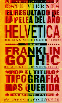
Último Momento: La Helvetica y la Franklin Gothic se vuelven a enfrentar

HELVETICA2012
(Afiche digital realizado por El Norbi)
Hace cuatro años, en Visualmente se planteó una pelea entre dos tipografías parecidas. Ese era el resultado de la única encuesta crítica que se había realizado sobre tipografía del mundo. Casi 200 profesionales nos habían contado sus opiniones más sinceras sobre las fuentes tipográficas. Eran tres simples preguntas. Una de ellas, la que hablaba del odio o desprecio que uno puede sentir por ellas, arrojó no pocas sospechas. También la pregunta que tenía que ver con los usos tipográficos ofreció una serie de datos que confirmaban aún más las sospechas. Pero la pregunta que tuvo una respuesta sorprendente tuvo que ver con el cariño o devoción hacia ciertas fonts.
Ese primer resultado nos lleva hoy a una especie de segundo round en esta pelea. Es que los diseñadores Stefan Sagmeister, Steven Heller y Kevin Finn, acaban de crear un juego de mesa, el DESIGNerd 100+ Graphic Design Trivia, que se centra en éstas formas. No es casualidad que una de las preguntas más complicadas del juego sea la que tiene que ver con identificar las diferencias que existen entre la Helvetica y la Franklin Gothic.
En Tipográficamente, nuestro blog sobre usos tipográficos, diseñadores, periodistas, tipógrafos, editores de diarios, infógrafos y directores de arte publicitario, han dado su parecer con respecto a esta discusión de estas formas. Y lo más interesante es que muchos de ellos siguieron opinando después que se conociera el resultado, ese que convirtió a la Helvetica como la campeona por sobre la Franklin Gothic. Pero eso que se conoció en abril de 2008, hoy ha cambiado.
Algunos que defendieron la Helvética:
1. Selva Zabronski, Directora de arte de la revista Genoma, Argentina, (+)
2. Andrea Araujo, Directora de arte del diario O Povo, Brasil, (+)
3. Kristin Lenz, Directora de arte del diario Hartford Courant, EE.UU., (+)

Otros que defendieron la Franklin Gothic:
1. Juana Medina, Diseñadora colombiana, EE.UU., (+)
2. Alfonso Gálvez, Editor de diseño del diario La Nación, Chile, (+)
3. Daniel Marsula, Director de arte del diario Pittsburgh Post-Gazette, EE.UU., (+)

7.1.12

Exclusivo: Lo último del francés Ty Lettau

Imagen 9
1. How this project is born pop / geek culture illustration?
Well, it started as something different, actually. I did the Animals set first. The original goal was to see how few geometric parts I could use to make an animal face... with the intent of then seeing how few parts I could replace to make a different animal face. I started with a Cat & Dog as my baseline. Then, it became about finding the essence of each animal... that thing that made them unique. So once I had a Cat, I could add stripes to make a Tiger, or spots to make a Leopard. A Horse and a Zebra are the same except for the pattern. And so on.
Imagen 16
So, once I had the basic building blocks it was easy. I did Star Wars next as a way to challenge my visual system to something beyond animals, and it worked really well. So once that set was done, I just went crazy drawing any pop culture thing that I could think of.


2. I worked to achieve such a synthesis? Which illustration was the most complicated?

The synthesis comes from being really strict about certain details. For example, the eyes very seldom change... and when they do, it is absolutely necessary. There are some basic rules I have for head size, hair size, helmet size. There's some standard parts for things like ears, horns, beards, etc. I have a palette of about 20 colors which everything conforms to. Basically, the amount of variation that is achieved in these illustrations is only possible because of the rigidity of certain parts of the visual system. That really was the entire reason for doing this... to see how many variations I could make with a fairly limited set of parts.

As for which were the most complicated... there emerged a few things that made certain illustrations more difficult.
Imagen 8
Imagen 7
Some were challenging because the original character was already so stylized. Take Spongebob or Daffy Duck. There is only so much you can do to change a character when their shape and style is what identifies them. So I did the best I could at unifying by using my patterns, but with a bunch of new parts. Sometimes it was the proportion or ratio of the original character that caused the problem. Anyone with a tall head or hat was very difficult.
Imagen 6
Others were challenging because there was so much detail. For example, Darth Maul has these really elaborate facial tattoos. So how do you simplify that down to basic shapes while still retaining the feel of them? It's actually really difficult to find that balance. But in the end, having too much detail is good, because you have a lot to choose to focus on.
Imagen 5
Imagen 4
Without a doubt the most challenging ones were when I had virtually no detail to work with. The more non-descript a character is, the harder it is to simplify them down to their essence. No question, the most difficult set overall was the U.S. Presidents. Here we have 43 characters, which save for Barack Obama, are all basically old caucasian guys. They aren't superheroes. They aren't creatures. They are just guys. So the only thing I had to work with was the hairstyle. This led me to a really wonderful little "coding" with this set. Their mouth gesture is code. A sad face meant that they were assassinated. A frown meant someone tried to assassinate them. A smirk meant that they were involved in controversy. You will then notice that these mouth gestures get used elsewhere. For example, Aerith from Final Fantasy was killed, so she has a frown. It became a really fun little detail that was born from a severe limitation.
Imagen 3

3. What was the criterion for selecting the characters?

I chose sets based on things that I liked. In general, everything I illustrated was something that I personally enjoyed... be it a toy from my childhood or a current TV show. I think the one that was most fun for me was Masters of the Universe, which I did as my fourth set. I had every MotU toy as a kid... and I'm not exaggerating either, I had every one. But, in the end, I had done pretty much everything I could think of anyhow, so the order I chose them didn't much matter.


4. How long it took to do this work?

I did the Animals set in August and the last upload was in November. So, I guess no longer than 3 months to do them all. It got easier and faster as I went on. By the end I had pretty much every part already drawn, so it was just a question of remembering where I had drawn it. I doubt that anyone would ever guess it, but these are all drawn in Adobe Fireworks. Not to sound immodest, but I'd challenge you to find someone who is faster in Fireworks than I am :P So, it just became a really smooth process after a while.
Imagen 2
Imagen 1

5. What is the picture that you like best? Why?

I have many favorites, which I actually have kept track of over the course of making 1280 of these. But I'll try to respect the spirit of your question and pick just one. So If I had to name just one illustration as the best, I guess I'd go with Anakin Skywalker's Redemption. It's not the most complex one, but this illustration is loaded with subtext. The little mouthpiece element reminds you that this is Darth Vader. It's from an extremely powerful movie scene in which the events of three films culminate in the redemption of the villain. I don't know, I guess this one just tells a story or evokes a memory in the way many of the others do not. And something just makes me chuckle about seeing sad or evil characters looking all cute in these illustrations.

works::astroboy

works::en vía libre

works::en metrópoli

type::mobype

type::stypenova

works::helvetica gothic

news::superman 2025

news::deadpool

news::Wolverine

works::japan

type::qr gothic

type::bob esponja

type::astroboy

type::big time

type::meteoro

type::pink

type::totoro

type::batman japan

THE QR SERIES

THE QR SERIES
El MIQR-EY MOUSE

LA PUQRA

Merry QRistmas

El Bender Baruch

kid works:: batman

kid works::superman

kid works::bender

kid works::wolverine

kid works::deadpool

kid works::iron man

kid works::spider jam

kid works::captain america

Archivo VisualMente

Mi vieja era de Boca

Mi vieja era de Boca
Especial Boca Juniors