.

Los columnistas de Visualmente::Carlos Gámez Kindelán::Rodrigo Sánchez::Jordi Catalá::Mario Tascón::Jaume Serra::Samuel Granados::Dolores Pujol::Fabio Marra::Luiz Adolfo::Leo Tavejnhansky::Massimo Gentile::Pablo Corral::Angel Casaña::Pedro Pérez Cuadrado::Tomás Ondarra::Kohji Shiiki::Elio Leturia::Rodrigo Fino::Ramiro Alonso::Sergio Fernández::Lo más leído de Visualmente::Portadas::Infofreak::Fotografía::Especial Helvética::Especial: Frases del 2008::Especial Cooper Black::Creatividad::Caricaturas::Cuartas Jornadas::Cumbre Mundial::Desnudos::Diarios impresos::Diarios online::Diálogos Visuales
Nuestros Blogs Asociados::Visualmente::Indio::Infograkids::Infografreaks::Infografreaks-edu::Mala Magazine::Bar Visual::Tipográficamente::Chillart::Universitariamente::Visualmente-Edu::Vía Libre::Bar Uch::Que Bien Que La Estamos Pasando::Twittermente::Seguinos en Twitter::Las editoras de Mala::Cristina Poetto::Miru Trigo::Ivonne Caamaño::Ana Ottone::Evita Las Tentaciones::Gaba Urco::Nacha La Macha::Beta Ramírez Bustelo::Carolina Ramírez::Connie Moreno::Juana Medina::Yanina Isabella Tejera::Anna Marti::Lina Delgado Cortés::Sofi Ginestra::India Herrera::La Bender Baruch::Los editores de Chillart::Martín Pons::Pinguboy::Raúl Manrupe::Elio Leturia::Les Cuevas Otonelli::Nathalie Sonne::Germán Kemerer::Lucas Groglio::Rodolfo Fernández Alvarez::Raúl Della Valle::Julio Cuervo::Javier Cuello::Julián Chappa::Fabián Carreras::Jenny Canales Peña::Gastón Caba::Pablo Bobadilla::Federico Fuertes Guzmán::Bender Baruch::Seguinos en Twittermente

3.7.07

Exclusivo: Lucie Lacava nos habla sobre tipografías

lucie111
cumbreCHICA 
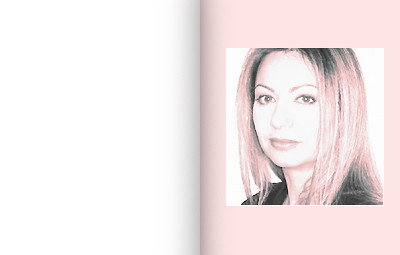
(Lucie Lacava, consultora canadiense, Lacava Design)
Qué tipografías...: 1) Usas frecuentemente? (Por qué?)
None really. I prefer to use a new font for every project. If I ever use a font more than once, it would have to be in a completely new context. For example, if I originally used it for titling, I might use it again for navigation. But have a difficult time using the same fonts again on other projects because in my mind they are so imbibed with the essence and personality of the original project, I have to let some time go by before I use them again.

2) Prefieres? (Por qué?)
If I had to spend the rest of my life on a deserted island I would take with me Futura and Bodoni. I will never grow tired of the Didones and Geometrics, because of their clean, simple, and elegant lines.
Earlier in my career I liked using mostly the classics and their revivals. Today I have an insatiable thirst for new releases. I especially like to have new fonts custom designed for my projects, and I love these fonts because they reflect exactly my vision for the project. It's like being fitted in haute couture by Karl Lagerfeld.

3) Odias? (Por qué?)
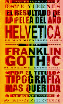
I like to keep an open mind, because my taste keeps on evolving. But I hate fonts that become too popular, with the exceptions of a few more obiquitous, generic older fonts like Franklin or Helvetica, these are like tofu you can turn them into anything you like. I generally feel antipathy towards the Humanists, both serif and sans, especially when applied in large quantities, as in a publication. I also dislike most scripts. However, any font used in the right context and in small doses can look gorgeous. Take for instance any letter from the ugliest font ever and blow it up to 1000 points, then imagine it used as a background for wallpaper, a poster, or a t-shirt in your favorite colours, and it might start to grow on you.

No hay comentarios.:

polaroids visuales

lo mejor del 2012

works::googleopoly

works::kiss einstein

works::Beatles Stereo

works::PORTADA TIPOGRAFICA

works: yeah, yeah, yeahs

Seguidores

BIG TASTY VISUAL

Cerati no murió

Periodic Table of Typeface

newsgames de ian bogost

pantone gámez kindelán

proyecto walsh

THE QR SERIES

THE QR SERIES
EL QRIFER

El ORIGINAL

QR-VERANO

El MIQR-EY MOUSE

LA PUQRA

El Black Demon

El QR Pí

El QR JOJOJO

Merry QRistmas

El Bender Baruch

El Norbarba

Le Garq

El Norwerine

Archivo VisualMente

COOPER BLACK FETICHE

Gabriel Campanario

made in japan

norberto chaves dixit

Nuestras categorías

Mi vieja era de Boca

Mi vieja era de Boca
Especial Boca Juniors

Blog miembro de la Asociación 3.0
30

(El autor del logo es Rodrigo Visscher. Fue elegido a través de un concurso abierto organizado por VisualMente.)

Nuestros reportajes

Hazte amigo-Facebook de El Norbi

Johnny Depp tipográfico

Helvética, la bestia pop

Helvética, la bestia pop
Especial Helvética

SAVE THE CHIRINGUITO

METROPOLI COOPER BLACK