
Lo Mejor 2011: Exclusivo, te presentamos al ilustrador Alex Bloom
No muchos conocen El Alamo Drafthouse Cinema. Ni los sitios de diseño que levantan sus afiches de cine, sin informar de dónde son ni quiénes los hacen. El Alamo es una sala de cine, ubicada en Austin, Texas, que se especializa en proyectar películas clásicas. Uno de los programadores, el director Quentin Tarantino, siempre filtra alguna de sus películas fetiches clase B dentro de la programación. Si algo caracteriza a los afiches que se utilizan para publicitar las películas, agotados en la mayoría de los casos, es la libertad total que tienen los artistas para crearlos. Aunque la característica principal es lo vectorial, los carteles de El Alamo son muy personales. "Elegimos las películas para hacer los afiches sobre la base de popularidad, y buscamos a los artistas en función de su entusiasmo con la cinta", sostiene su mentor visual, el norteamericano Tim Doyle.
El 8 de junio del año pasado, te presentamos al ilustrador Alex Bloom, uno de los creadores de varios de estos afiches, logrando un nivel de conceptualización y minimalismo que nos gustó mucho. En exclusivo para Visualmente, su palabra y sus últimas creación para El Alamo.
1. How the idea for THE ROLLING ROADSHOW?
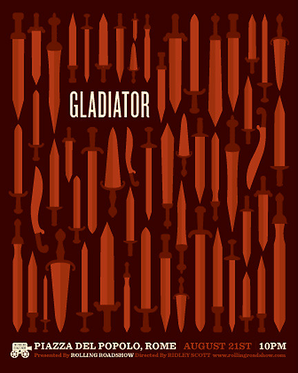
The Rolling Roadshow was a student project, based upon a real event organized by El Alamo Drafthouse Cinema in Austin, Texas. It is a traveling cinema tour that projects films in locations relevant to their content. I chose to create a campaign promoting a stop of the tour in Rome, Italy.
I started with the posters, and each one takes an object from the film that represents the overarching themes. I created slight variations on each object and built patterns that served as the system for the rest of the collateral.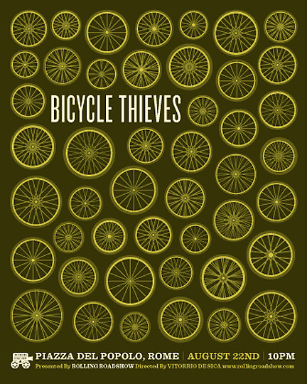
2. For you, what styles are best accomplished? and why?
Though much of my work has Illustration, I don't think I feel that I gravitate towards any particular style. I like to experiment with different mediums, but I find that time constraints and a need for repetition and geometric shapes often drive me to vector.
3. You worked with a vector drawing program or pre-made sketches in pencil? Also gave a termination in Photoshop which makes it vintage. Why?
I always begin concepts with loose sketches, but I find that I can build out concepts more efficiently in Adobe Illustrator. For this project, I worked almost entirely in vector, start to finish. There isn't any kind of Photoshop treatment, except for basic contrast on the photos in the brochure.
In terms of the vintage feel, I was really just aiming to create a cinematic mood. I thought about the experience of going to the Drive-In or outdoor theater, which always happens at dusk and night. I tried to develop color palettes and vignetting that reflected that feeling and conveyed the emotional tones of the films.
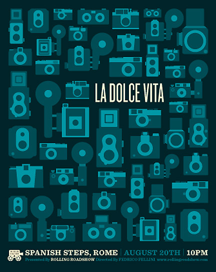
4. For example, how was the creative process in the case of La Dolce Vita?
I watched each film before I ever began sketching. La Dolce Vita was actually the first film I watched. I borrowed it from the library and spent an evening at home, just taking notes on as much as I could, the concepts, characters, atmosphere, lighting, etc. It was a complicated film, because there are so many different intertwining themes and plotlines, but I had noted elements of consistency in imagery and tone.
I chose the Camera as the object because it appeared in so many scenes, but also because it could embody the ideas of celebrity, vanity, and detached observation of life, as well as some of the countless other themes that I felt Fellini was trying to express.
I began illustrating the cameras in vector, just trying to use simple shapes. I referenced the film often to see the different styles, and made variations based on my notes. I worked on all 3 posters simultaneously, developing the simple vector shapes for each, and then spent some time thinking through the colors for each film. I chose the deep blues for La Dolce Vita because the mood of the Film seemed to ask for it. All of the shots at night, the iconic Trevi Fountain scene, and the extended moods of isolation and depression.
I picked the typefaces as I developed the illustrations, though I feel they represent the Alamo Drafthouse Cinema and the city of Rome moreso than the particular films. I finished the posters by picking the headline size and fine tuning the spacing between each object, which was one of the most time consuming parts of the project.
5. How much time does it take you to design one poster?
It really all depends on the poster. Some take a few hours, others a few days or even weeks depending on how quickly ideas develop. For me, the most time-consuming step is always defining a good concept, once the ideas are clarified, the process just zips right along.


+15.06.00.png)